How I prepared the deficit chart is explained in the
first post in which it appeared. The source of the figures-the Congressional Budget Office-is linked to.
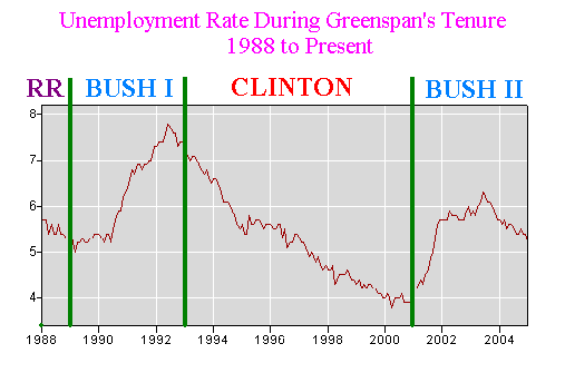
The
second chart was made by the Department of Labor graph making engine. I just put the demarcations between presidents using Microsoft Paint.
Both charts are for Alan Greenspan's term at the Fed.
If you want me to give the path to check the figures at the Department of Labor, just ask.
Incidentally, I am just using the most used figures for unemployment. I really do think the whole picture favors Clinton even more, but this is the most familiar figure, so I used it. The Department of Labor uses several figures.