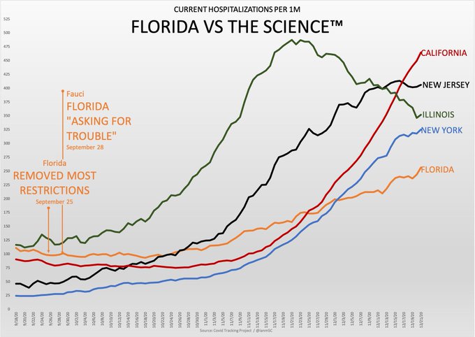
You might recall seeing this "informative" graph a few pages back; it's part of the MAGA-media's effort to smear Fauci and public health officials, and convince people to ignore calls for mask-wearing and social distancing.
Basically, these people start out with their own story and then try to find "facts" which fit their narrative — very unscientific. Do you think there might have been some cherry-picking going on? Why just list five "blue" states to contrast with Florida? Also, notice that no further facts are provided, only the one graph which appears to prove a point. But there are social, economic, and geographical differences between these states which affect their rates of infection.
And just because some states have imposed restrictions and other haven't, it's naive to think that mask-wearing and social distancing are universal in those states with restrictions and completely ignored in those states without restrictions. Risk-averse people around the country have altered their behavior regardless of the policies of their state governments. And the fool-hardy continue to flaunt their denial of the disease. I still see quite a few unmasked people in my mask-mandated state.
The graph is a snapshot, selected to back up a particular story line. But it's too early to draw sweeping conclusions. The pandemic is still here. We don't know what effect the holiday season and cold weather will have on the rates of infection. The graph could look very different in a month and it's stupid to assume that we already know enough to draw conclusions.