@McGentrix,
Quote McGentrix:
Quote:Your graph is severely skewed. It doesn't even cover a 10% spread
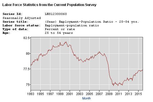
Oh, so in other words all graphs must go down to zero or else they are "skewed"? I call bullshit on that. You clearly have not seen a great number of graphs in your life, because most graphs simply go down to slightly below the lowest numerical value of the chart. The graph maker assumes the reader is someone who understands this.
Incidentally, are you trying to say that a difference of 4% or more in the Employment-Population ratio is not significant and worthy of attention? Remember, you are talking about millions of jobs here.
When it comes to Labor Force Participation Rate, you righties can't shut up. But put the far more accurate Employment-Population ratio in prime earning years, (25-54), up there, and you cry "Foul!"
The graph shows the rise and fall of the percentatge of people employed during their prime working years under three Presidents. You can make of it what you will. Sorry to have actual data and facts intrude on the other posters' speculations, not that there is anything wrong with speculating. But there is also a place for data as well. That's why I'm posting it again. So you can cry, "Spam!"
