@hightor,
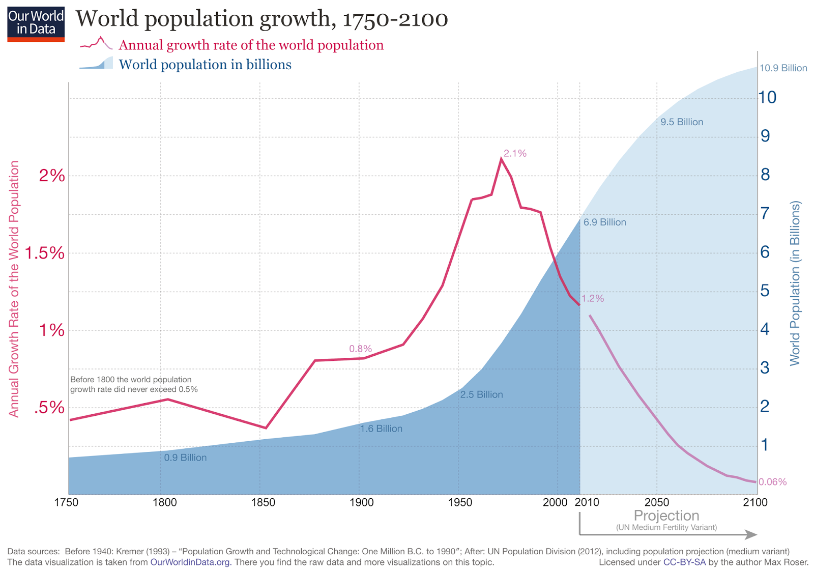
You choose this graph because it looks dramatic, not because it is an accurate description of what is actually happening. I do not believe this graph is close to mathematically correct, and even if it is... it is not showing what is really happening.
Let's look at a more informative graph...

If you shut off your ideological need for outrage for a moment, this graph is interesting. It shows that population growth peaked at about 1960 and has been dramatically declining ever since.
The projection assumes that the growth rate will continue to decline. This is a reasonable assumption given that the trends causing this decline are continuing.
Ironically, if there is an apocalyptic climate disaster with disease and famine (as some here seem to be predicting, the population growth will be even lower than this graph indicates.
The reason for the dramatic population growth up until 1960 was
increasing global prosperity. People weren't having more kids during this time, we were just keeping them alive. When food was plentiful, clean water became widely available and we started curing diseases even in developing countries, that is when population rocketed.
In 1960 we started pushing family planning efforts and the US worked in national development (particularly woman's rights). That was the reason for the dramatic turn-around.