1
   

Cy Twombly or Changing One's Mind


AngeliqueEast
 
  1  
Reply Fri 30 Sep, 2005 05:05 am
http://home.sprynet.com/~mindweb/OhneTitel.jpg

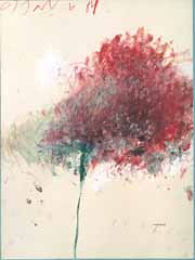
Now I learned that line was regarded as the most basic visual element. I can see that here. I also learned that line has been closely associated with the intellectual side of art. How can this be, if I see no form or even a composition?

I'm still studying this artist. I wonder if the old controversy of line versus color would apply in this case?

For me color, and line are equally important!
0 Replies
 
AngeliqueEast
 
  1  
Reply Fri 30 Sep, 2005 05:14 am
http://www.s-t.com/daily/02-97/02-02-97/kooning.jpg
By De Kooning

Now this one I like. It has a nice balance of line, and color, plus an interesting composition.
0 Replies
 
AngeliqueEast
 
  1  
Reply Fri 30 Sep, 2005 05:17 am
JLNobody wrote:
The fact is that there are many works by Picasso, Matisse, Tamayo, Diebenkorn, deKooning, and Miro (some of my favorite painters) that do not move me aesthetically or emotionally. But those painters have produced some of the greatest works in my opinion.


I agree, a work of art has to speak to me in a special way, and move me emotionaly.
0 Replies
 
AngeliqueEast
 
  1  
Reply Fri 30 Sep, 2005 05:33 am
I love Keith Morrison. Excellent use of color, and great compositions.

I like his primitive style paintings like: Posse, A Night in Tunisia, and others.

I love his Gimme a Pig Foot. What a great composition, and his use of red as the dominant color of the composition.
0 Replies
 
AngeliqueEast
 
  1  
Reply Fri 30 Sep, 2005 05:34 am
JLNobody wrote:
I like the composition in this goache by Morrison.
http://www.artsmia.org/collection/search/art.cfm?id=6023


Sorry to say that link did not work for me.
0 Replies
 
AngeliqueEast
 
  1  
Reply Fri 30 Sep, 2005 06:14 am
farmerman wrote:
Two artists come to mind, Helen Frankenthaler and george Morrison. Frankenthalers work, from my early experiences were like oily sandwich wrappers to me. I then saw some of her theme pieces of blues and Orange and was blown away also.
"Something going on here" was my only verbal response. I remember standing and looking at her work for quite a while.
George Morrison, had always prodeced these large , very thick works of primary spectral colors in blocks. Then I saw his works at the American Indian museum of the Smithsonian. I really connected to his interlacing masses of colors that recreated an abstract vision of the cliffs around the Great LAkes,Also In each painting there is the horizon, which commands attention in everything he paints. He also did some works of interlocked wood slabs, almost like mosaics.


I found G. Morrison. I like him very much. His Red Totem is beautiful, loved his wood collage, and many others.

What is Frankenthalers first name please?

Thanks for the information Farmerman.
0 Replies
 
ossobuco
 
  1  
Reply Fri 30 Sep, 2005 09:04 am
Helen
0 Replies
 
AngeliqueEast
 
  1  
Reply Fri 30 Sep, 2005 09:09 am
Thanks osso. I checked both of the artist Farmerman spoke about. I like Morris, but could not find enough of Helen's work to make up my mind. What I did see of her work, I did not care for.

Thanks Farmerman
0 Replies
 
farmerman
 
  1  
Reply Fri 30 Sep, 2005 09:10 am
Angelique-Helen Frankenthaler. My initial feelings about her work were based upon a series they had displayed at the Philly Gallery. She was famous for painting directly on unprimed canvases and she let the linseed oil seep into the unpainted margins. Looked contrived. Then I saw some of her colr studies like orange on dark blue.
Not every work by every artist is a winner. I find Twombly mostly unwatchable. I dislike his scribbles but I like some of his colorist stuff.
0 Replies
 
AngeliqueEast
 
  1  
Reply Fri 30 Sep, 2005 09:16 am
farmerman wrote:
Angelique-Helen Frankenthaler. My initial feelings about her work were based upon a series they had displayed at the Philly Gallery. She was famous for painting directly on unprimed canvases and she let the linseed oil seep into the unpainted margins. Looked contrived. Then I saw some of her colr studies like orange on dark blue.
Not every work by every artist is a winner. I find Twombly mostly unwatchable. I dislike his scribbles but I like some of his colorist stuff.


I saw two of Twombly's color works. I still have to see more to be fair to the artist. What I did see I did not like. They did not do anything for me, nothing.
0 Replies
 
goodstein-shapiro
 
  1  
Reply Fri 30 Sep, 2005 10:33 am
ae, the four paintings that I saw at MOMA were different from the earlier work of Twombly's that I had seen . The four paintings were more complex in structure, used color in a fuller way with a full palette. The forms in the painting were not "scribbled" nor did they look "scribbled". The forms were painted, and the painting structure itself created such vast spatial quality that the forms seemed to fly around the immense exhibition room.
0 Replies
 
AngeliqueEast
 
  1  
Reply Fri 30 Sep, 2005 10:39 am
The two or three that I saw on the net were supposed to be his last works, and he used color. Let me see if I can find them.
0 Replies
 
AngeliqueEast
 
  1  
Reply Fri 30 Sep, 2005 11:08 am
These are some of the color works by the artist that I found on the net. I also found others with many scribbles, and symbols but, for some reason I could not post the link or copy, and paste them individual.

http://www.nymuseums.com/lm05022a.jpg

http://www.georgetown.edu/faculty/irvinem/visualarts/Image-Library/Twombly/cy-twombly-crossing.jpg

http://www.abc.net.au/arts/visual/stories/venice/twombly_01.jpg

http://www.abc.net.au/arts/visual/stories/venice/twombly_02.jpg

http://www.abc.net.au/arts/visual/stories/venice/twombly_03.jpg
0 Replies
 
AngeliqueEast
 
  1  
Reply Fri 30 Sep, 2005 11:17 am
I'm not sure if these are the ones I first saw of his. Are these any of the ones you saw at the MOMA?
0 Replies
 
AngeliqueEast
 
  1  
Reply Fri 30 Sep, 2005 11:22 am
KK, I see now. I got confused with some of the paintings I saw in the links that osso posted.
0 Replies
 
goodstein-shapiro
 
  1  
Reply Fri 30 Sep, 2005 01:36 pm
ae, the images by Twombly that you posted look like PIECES or PARTS of the paintings that I saw at MOMA, not the complete work....except for the top 2 with off white backgrounds, which bear NO resemblance at all. However, it is difficult to judge a painting on any part of it, no matter how well done it may be.
0 Replies


Related Topics

 
Copyright © 2025 MadLab, LLC :: Terms of Service :: Privacy Policy :: Page generated in 0.04 seconds on 05/04/2025 at 04:33:17