4
   

Decorating opinions please - Colors!


chai2
 
Reply Fri 17 Nov, 2017 06:03 pm
Which combo do you prefer?

The gray and green?
Or gray and yellow?

Or gray and ?????

I have a medium gray sofa, and some retro-ish green accent chairs.
Also, various throws, pillows, etc.

I want this theme of a gray accent wall in each room, along with the other color, to run through the entire house.

http://st.houzz.com/simgs/3481b83d011ceeca_8-0548/eclectic-dining-room.jpg

https://cdn.decoist.com/wp-content/uploads/2015/03/White-trims-bring-added-beauty-to-the-gray-dining-room.jpg

The dark gray and yellow of the rug...

https://i.pinimg.com/736x/73/7e/71/737e71d4da03c2e3ce81a3773eb8a3e8--grey-yellow-kitchen-yellow-kitchens.jpg

The gray and the lampshade...

https://i.pinimg.com/736x/da/8d/c1/da8dc1c5b5a1bd397b3bf975f6cb560b--grey-bedroom-paint-grey-bedrooms.jpg


  • Topic Stats
  • Top Replies
  • Link to this Topic
Type: Discussion • Score: 4 • Views: 1,233 • Replies: 10
No top replies

 
chai2
 
  1  
Reply Fri 17 Nov, 2017 06:27 pm
Oh, one other thing, I'm not a fan of bright cheery colors, or pastels.

I'm a creature of the night.

The walls at my house are all camel, bronze and darkish red.

The idea of having most of the walls yellow or green at the house I'm talking about doesn't set right with me. It's jarring. I like a place of rest.

My intial thoughts were to have a scrumptious velvety gray color, and yellow or green as the accent wall.

My friend tells me that would be too much gray. I tend to agree, but then again, he's of the ilk that just loves stark white walls, and uses them as a canvas for his imagination.

So now I'm wonder about having one wall the dark gray, one wall the accent color, and the other 2 walls a lighter shade of gray.

This place will be rented as furnished for hopefully half the year, so it also has to please the hoi polloi.
Sturgis
 
  1  
Reply Fri 24 Nov, 2017 04:46 pm
@chai2,
I find a splash of color wall works best for me, usually a red or apple green. That said, I once had a bedroom and entry hall painted in a eye piercing neon green. The carpet in those areas was a mixd brown and burnt orange.

My current exposed wood floors are painted battleship grey as are a file cabinet and legs of an end table. Walls these days are mostly sandlewood (light-medium brown). I can't handle yellow.

Have you considered going retro and putting up faux wood paneling?
chai2
 
  1  
Reply Sat 25 Nov, 2017 07:45 am
@Sturgis,
Sturgis wrote:


Have you considered going retro and putting up faux wood paneling?


Shocked

Uh, no.
0 Replies
 
chai2
 
  1  
Reply Sun 14 Jan, 2018 09:11 pm
Well, the furniture arrived.

I had gotten a great deal purchasing the staging furniture from another house.

My friend is sending me pictures of it, and I realize I have to change my color plans.

Downstairs living room walls will be gray or taupe with some navy accents in the The couch and arm chairs are dark gray in in a more modern design that I remembered. There are a couple of smaller chairs in a yellow green.

I could have put the yellow green chairs in another area, but because of the moderness of the overall design, my first paint ideas wouldn't work. I had at some point come to the conclusion to paint the entire house in camel and red, which are the colors in my home. I figured why not go with what I already know.

But, camel and red gives a traditional look, and the furniture and colors would clash.

However, I am going to go with making the stairwells and bedrooms camel, and accents of red in a few place not on the first floor. I'll go with camel in the bathrooms and kitchen too, as the shades of tile in there would compliment.
Sturgis
 
  1  
Reply Mon 15 Jan, 2018 12:12 am
@chai2,
Sounds like it's moving along nicely.

Curious as to the red you're planning to use. A deep, darker or a lighter shade? Red in general is a favorite for me, but, then it needs to be thought through so there aren't clashes.
chai2
 
  1  
Reply Mon 15 Jan, 2018 09:06 am
@Sturgis,
Sturgis, look up on the Sherwin Williams site "Stolen Kiss."

I'm bummed I can't use it downstairs, nor the camel, which on the SW site is call "Bosc Pear"

The staircase is enclosed, so from there up I'll use the Bosc Pear in that stairway, and over the entire 2nd floor, and the stair hallway leading up to the roof.
The Stolen Kiss will go in a tiny alcove on the 2nd floor where one would put a computer or desk or something. Also, on the stairway there are I think 4 or 5 small little interior window openings that allow light from the exterior windows on the other side of the stairs to flood through to the 2nd floor hallway/common area. I think I can paint the interior of these openings red too. Those little openings are maybe 12" x 6". A perfect place to put small crystal objects to catch the light.

Downstairs, during the day it gets so much light it's practically like being outside. Because of that I think I can get away with darker colors on the wall.

On most of the walls I'm thinking Sherwin Williams "Virtual Taupe", and on the accents "Anchors Aweigh"

The green/yellow occassional chairs are close to a color called Limon Fresco.

Sherwin Williams has a store in San Miguel de Allende, so I'm able to do at least part of the planning from afar.

The sofa and armchair are a dark gray, will have to be there personally to see how it looks. Of course you don't want an exact match of the color on the walls, and I think a taupe will go well.

They have a fun tool on the Sherwin Williams site where you can design rooms.


I'm going to drive down there Feb 9 or 10, and stay for about a week.


DOWNSTAIRS


Virtual Taupe:
https://sherwin.scene7.com/is/image/sw/color-swatch?_tparam_size=250,250&layer=comp&_tparam_color=8A7A6A


Anchors Aweigh:
https://sherwin.scene7.com/is/image/sw/color-swatch?_tparam_size=250,250&layer=comp&_tparam_color=2B3441


Limon Fresco:
https://sherwin.scene7.com/is/image/sw/color-swatch?_tparam_size=250,250&layer=comp&_tparam_color=CEBC55


UPSTAIRS

Bosc Pear:
https://sherwin.scene7.com/is/image/sw/color-swatch?_tparam_size=250,250&layer=comp&_tparam_color=C09056


Stolen Kiss:
https://sherwin.scene7.com/is/image/sw/color-swatch?_tparam_size=250,250&layer=comp&_tparam_color=813235
Sturgis
 
  1  
Reply Mon 15 Jan, 2018 03:08 pm
@chai2,
Those definitely seem to be a good set of colors and from how you've described things, it will feel quite inviting for you (and anyone you allow indoors).


The anchors aweigh blue is a bit tough to get a feel on. It same lighter in some website shots and closing in on a dark slate sidewalk in others (oddly I like both. Odd because there was is much blue in my mother's homes over the years I usually bolt from it)
chai2
 
  1  
Reply Mon 15 Jan, 2018 04:09 pm
@Sturgis,
I know, I actively dislike blue.

I used to think it was because of 12 years of catholic school uniforms.
However, I realize it's really just the light "cheery" blues I dislike.

Navy blues and such aren't a problem apparantly.

When I sent those colors to my friend, he was saying that he was thinking of painting his laundry room, and had looked at a color called Naval.

It's in the same family of blue as Anchors Aweigh. Just a slightly different shade. I think it's got a drop of dark yellow in it.

Between the 2 of us, we'll come up with something. I said whatever is decided upon he'll have whatever leftover blue to paint his laundry room.

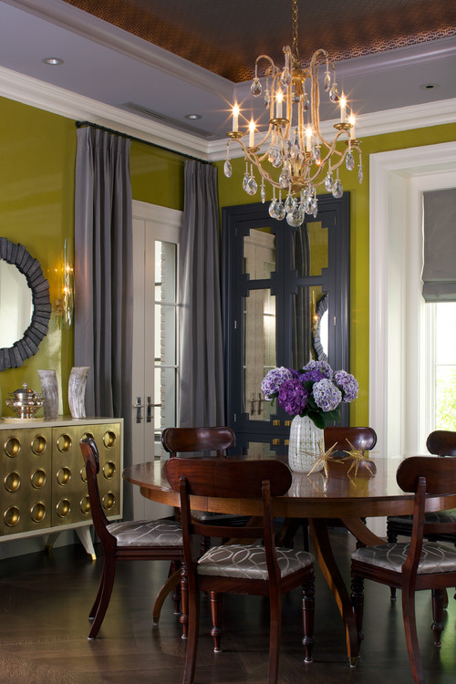
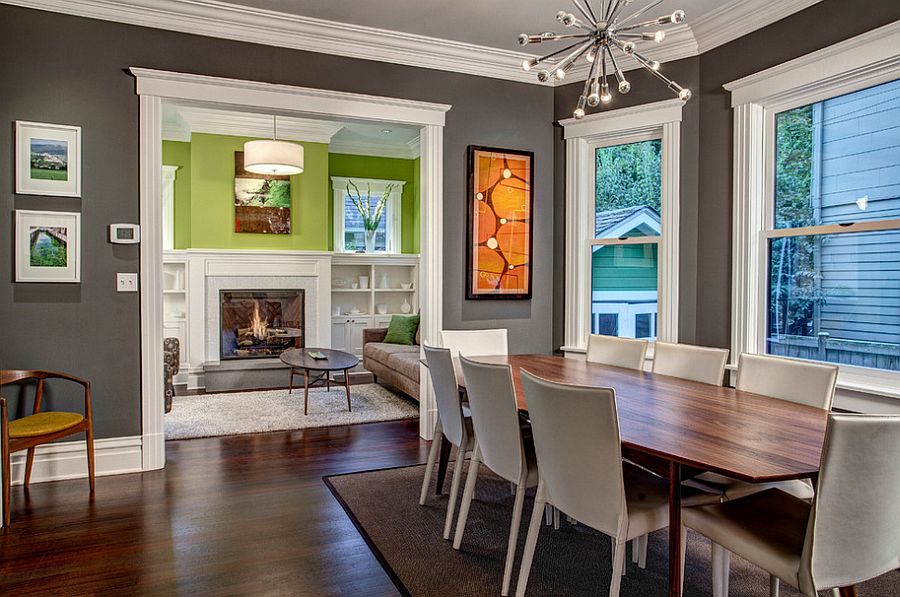
Maybe this subject seems overkill to a lot of readers, but color is just that important to me. The smallest shade difference can really change a room.

I think I got my pickyness about colors from my mother. One time (after I left home) she had painted a smallish area red, and then went out to get a loveseat to fit there. She found one that had a red floral pattern (yikes anyway). The thing is, she had no concept that the red on the wall was an orange red, and the chair was a blue red. When I walked in the entryway of the house and saw it, I thought she was joking. I pointed it out to her and she just shrugged and said she thought it was fine and gave me her usual "I don't know what you're talking about". She never went and had the wall repainted, which was the obvious solution. It just looked so tacky together. She also wore gawd awful colors like pastel this that and the other. As a kid, that's what I wore because she obviously bought them. As I grew I realized I was definately a winter in that color wheel thing.

Funny thing, those colors are all the ones they tell a woman to base her wardrobe on, and accessorize around it. Same thing for a man I suppose.

Gray, navy, red, camel, blacks whites etc.

You just can't go wrong.
chai2
 
  1  
Reply Mon 15 Jan, 2018 04:15 pm
@chai2,
So similar.

I think the AA has more black, the Naval more yellow.

I know they look more or less alike, but when you use the room decorating paint tool on the site, and you put each blue next to the taupe, you can see the difference.

Yes, I am crazy.

https://sherwin.scene7.com/is/image/sw/color-swatch?_tparam_size=250,250&layer=comp&_tparam_color=2B3441https://sherwin.scene7.com/is/image/sw/color-swatch?_tparam_size=250,250&layer=comp&_tparam_color=8A7A6A https://sherwin.scene7.com/is/image/sw/color-swatch?_tparam_size=250,250&layer=comp&_tparam_color=2F3D4C
0 Replies
 
toto26
 
  -1  
Reply Fri 28 Sep, 2018 12:23 am
@chai2,
I prefer a lighter gray with maybe a purple? You can have gray with almost anything, even looks nice with turquoise.
0 Replies


Related Topics

Window film - Opinions please - Discussion by chai2
What kind of runner rug is this? - Question by Kingofthekats
Refurbish a Sofa - Question by gollum
Need suggestions on decorating!! - Question by rae22
Would like to DIY the wall? - Question by Molly3
Any wreath makers here? - Question by boomerang
Color! Color! Color! - Discussion by plainoldme
Chairs sold seperately. - Question by boomerang
 
  1. Forums
  2. » Decorating opinions please - Colors!
Copyright © 2024 MadLab, LLC :: Terms of Service :: Privacy Policy :: Page generated in 0.03 seconds on 04/26/2024 at 01:53:42