1
   

The Rothko Seagram Murals, Simon Schama's Power of Art


Reply Tue 31 Jul, 2007 11:06 am
I don't know if you are all following the PBS series "Simon Schama: The Power of Art." I've recorded them all on my DMR so I can burn DVD's (the series set is available for $ 49.95 and the book for $ 50.00.

This week was Mark Rothko and his ultimate masterpieces that he was commissioned to paint for the Four Seasons restaurant in the Seagram Building, NYC. The commission was instigated by Mies Van Der Rohe, the architect of that icon of modern architecture.

Here's a link to the BBC site with eight excerpts from each of the eight episodes:

Simon Schama's The Power of Art

Here's an article in The Guardian about the enthralling story of the fate of those paintings and how they ended up at The Tate Museum:

The Guardian Article on the Rothko Seagrams Murals

The exhibition at the National Gallery:

The National Gallery Rothko/Seagram Murals Exhibition


Red on Maroon 1959

http://www.tate.org.uk/collection/T/T01/T01165_9.jpg
  • Topic Stats
  • Top Replies
  • Link to this Topic
Type: Discussion • Score: 1 • Views: 18,140 • Replies: 54
No top replies

 
Amigo
 
  1  
Reply Thu 2 Aug, 2007 03:40 pm
Bookmark

(reading the Above material)
0 Replies
 
farmerman
 
  1  
Reply Thu 2 Aug, 2007 04:39 pm
Ive been watching the Shama series and am loving it. I especially dug the Caravaggio piece. I want these DVD's and will spend anything to get them. Shama, although he sounds so damn pompous and condescending, is waay better than the ARt Nun they had on a few years ago. I like the aspect of the detailed look into the world of that artist .
Rothko has never been one of my favorites because of his choice of colors , but you cant help understanding his work after Shama's presentation/
Thanks for the links
0 Replies
 
Lightwizard
 
  1  
Reply Thu 2 Aug, 2007 07:39 pm
You really can't get Rothko's color juxtaposition in reproductions. I've seen a lot of his paintings in person and there's both a stillness and a turmoil in each image. The tension comes from behind the picture plane but it's unmistakable that he is playing on one's emotional response to color. This could mean you might not like, or maybe not understand, what you see -- it may be a feeling of sadness and that's where the story surfaced of viewer's coming to tears in response to a painting. It's quite possible for an abstract painting to stimulate sad, unpleasant memories, but sometimes happy memories or even angry memories. It might be a little of all emotions. I feel there's always a memory response to any abstract based on one's life experience -- it's Rothko's subconscious communicating to one's own subconscious that is the extraordinary quality of his painting. He was a master at it. This is exactly why those canvasses never made it into the Seagram building and he turned down a great deal of cash. A remarkable story and Schama I think is witty and earthy in his assessments. I think the physical posturing in many of the shots is more the cinematographer than Schama himself, as many of the show him in a softer, more vulnerable stance.

Seeing Rothko's work in person, the first astounding effect is that the colors are floating in space -- the canvas is not flat but not even three dimensional. It's almost like colored fogs trying desperately to find some form.

I also loved the Jacques Louis David "The Death of Marat" episode. The one painting he produced that practically nobody wanted to look at in his time. Now it's an icon of socio-political visual statements.
0 Replies
 
ossobuco
 
  1  
Reply Thu 2 Aug, 2007 07:50 pm
I just ran across my 2005 Rothko calendar... (oh, never mind).

TVless, I look forward to the DVDs.

This by way of bookmarking...
0 Replies
 
Lightwizard
 
  1  
Reply Thu 2 Aug, 2007 07:55 pm
It's $ 34.49 from A2K Shop:

The Power of Art

Pretty good discount and it helps support the site.
0 Replies
 
Amigo
 
  1  
Reply Thu 2 Aug, 2007 08:05 pm
http://www.poster.net/rothko-mark/rothko-mark-blue-and-grey-3500039.jpg

I don't know what to think about this guy.

But I do think this kind of painting has been very abused by bad artist. Iv'e seen them do this kind of painting in those cheesy decorator show on TV. That must piss Rothko off (or make him lagh)
0 Replies
 
Lightwizard
 
  1  
Reply Thu 2 Aug, 2007 08:10 pm
Well, yes -- from the grave. Very Happy

Those "artists" are attempting to copy Rothko or other great abstract painters but they just don't have a clue. It took Rothko twenty years to finally develop the imagery.
0 Replies
 
Amigo
 
  1  
Reply Thu 2 Aug, 2007 08:12 pm
Twenty years! My eyes are ignorant I have no idea what I'm looking at.
0 Replies
 
Lightwizard
 
  1  
Reply Thu 2 Aug, 2007 08:20 pm
You can actually order a poster of that in as large a size as 48" x 72" which is, I believe close to its original dimensions -- have to search online for that.


Blue and Gray

I've seen that painting at a Rothko exhibit years ago at, I believe, the LA County Museum. The large grayish-white cloud demands one's focus but the iintense blue is fighting for attention. It's rather ying and yang. I remember the image kind of made me feel anxiety at first and then a rather sublime peace came over me.
0 Replies
 
Lightwizard
 
  1  
Reply Thu 2 Aug, 2007 08:28 pm
You want drama? Here's drama!

Green and Tangerine on Red


http://www.phillipscollection.org/american_art/artwork/images/Rothko-Green_and_Tangerine+.jpg
0 Replies
 
Lightwizard
 
  1  
Reply Thu 2 Aug, 2007 08:31 pm
Green and Maroon 1953

http://www.phillipscollection.org/american_art/artwork/images/Rothko-Green_and_Maroon+.jpg
0 Replies
 
Lightwizard
 
  1  
Reply Thu 2 Aug, 2007 08:35 pm
http://www.metmuseum.org/toah/images/hb/hb_1985.63.5.jpg


No. 13 (White, Red, on Yellow), 1958

Circa the Seagram murals.
0 Replies
 
farmerman
 
  1  
Reply Fri 3 Aug, 2007 07:15 am
HEy, If you apprecieate it ine.I like some of Rothkos early stuff, and not so much his "Albers" precursors.

David was also a food program. Theyve been showing them in a trange order here on Maine Pub TV.
Shama hd lso some efforts on criticism of new shows on commercial TV, I seem to recall his comment on SUn MORNING when the new Hopper retrospective was touring.
0 Replies
 
Lightwizard
 
  1  
Reply Fri 3 Aug, 2007 08:04 am
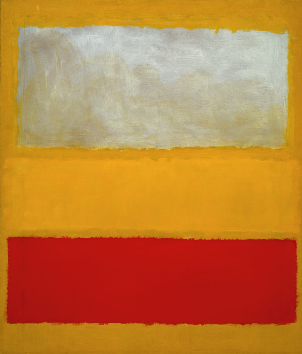
I actually find little relationship of Rothko's imagery to Albers. Albers was almost entirely a cerebral voyage through the science of color which spearheaded the genre of Op Art. Rothko went off on an entirely different route as a contemporary of Albers (the Homage to the Square) images spans the same period of the 50's through the 60's.


http://www.moma.org/images/collection/FullSizes/81133001.jpg

Josef Albers. (American, born Germany. 1888-1976). Homage to the Square. 1962. Portfolio of ten screenprints, composition (.3): 11 1/16 x 11" (28.1 x 27.9 cm)

The first obvious difference is the scale of the work. Albers were smaller studies in color combinations. Rothko canvasses are huge and the colors have depth and are not static, unlike the study of color combinations in Albers' Homage to the Square series.
0 Replies
 
farmerman
 
  1  
Reply Fri 3 Aug, 2007 08:11 am
The National Gallery has a number of Albers works that are huge.
To distingusih the differences is easy to accomplish merely by looking at the separation in time , Rothko was considerably dead when JA was cranking out hi work.

I stiil like Rothkos early stuff. Like Hopper, I only like Hoppers water colors, more spontaneous and immediate.

I like the way that Shama spends time on character flaws of the artists and especuially how each one is pulled out and detailed each week.

Got my order in for the DVDs
0 Replies
 
Lightwizard
 
  1  
Reply Fri 3 Aug, 2007 08:26 am
The only work I know of at the National Gallery are prints produced as lithographs or screenprints, which was typical of the Homage to the Square series -- I owned one of the 20" x 20" in the early 60's. I don't know of any Albers even close to the scale of a wall-filling prox. 100" x 80" as a typical Rothko. Even the smallest Rothko is twice the size of an Albers and is a painting, not a print.

Here's a 1954 Albers Homage to the Square

http://www.popartuk.com/g/l/lgalb354+study-for-homage-to-the-square-1954-joseph-albers-silk-screen-print.jpg
0 Replies
 
Lightwizard
 
  1  
Reply Fri 3 Aug, 2007 08:37 am
Compared to a 1954 Rothko "Homage to Matisse" 105" x 51"

http://www.christies.com/promos/nov05/broida_teaser/images/broida.jpg


Albers actually discontinued work on his famous glass paintings (he was a teacher and Bauhaus and later Yale) to embark on the Homage to the Square series in 1950, very close to parallel with Rothko developing his series of abstract imagery which culminated in the Seagram murals.
0 Replies
 
Lightwizard
 
  1  
Reply Fri 3 Aug, 2007 09:02 am
One of the few early paintings -- oil on composition board. Still only about 3' x 3':

Albers Homage to the Square: On An Early Sky

http://nga.gov.au/BigAmericans/large/32424.jpg
0 Replies
 
Lightwizard
 
  1  
Reply Fri 3 Aug, 2007 09:10 am
From an exhibition at PaceWildenstein in New York, alongside a Donald Judd from left to right: Donald Judd Untitled, 1985, enamel on aluminum, 11-3/4 x 59 x 11-3/4 inches; Josef Albers Homage to the Square: Arrival 1963, oil on masonite, 40 x 40 inches; Josef Albers Variation on Homage to the Square 1961, oil on aluminum. 20 x 20 inches

The 40" x 40" is about the top of the limitations of size Albers painted, most of his prints being about 20" x 20"


http://www.artcritical.com/baron/images/Albers-Judd-installation.jpg
0 Replies


Related Topics

 
  1. Forums
  2. » The Rothko Seagram Murals, Simon Schama's Power of Art
Copyright © 2024 MadLab, LLC :: Terms of Service :: Privacy Policy :: Page generated in 0.04 seconds on 04/18/2024 at 09:39:36