0
   

my latest series


Vivien
 
Reply Wed 4 Jul, 2007 01:41 am
http://img.photobucket.com/albums/v607/vivien/ejune07seascapesalltogetherandtosca.jpg
Time and Tide


this is the series of work that I've been working on for an upcoming show


they range from 35ins tall to 50 ins - you have to remember the scale, nearly as tall as a person, to see how they work - they simply don't work the same on a smaller scale.

The idea is to introduce the element of time - the tide coming in and out, the weather, season, light, colours all changing and as you glance over them or walk past them you have this sense of seeing time pass.

Some people don't like the long thin format but reaction from most people is really positive. It's an ongoing and ever changing series that's been going for some time.

There are of course also more traditional format images!
  • Topic Stats
  • Top Replies
  • Link to this Topic
Type: Discussion • Score: 0 • Views: 3,414 • Replies: 27
No top replies

 
shewolfnm
 
  1  
Reply Wed 4 Jul, 2007 05:29 am
Wow.
I would LOVE to see that.

The idea is fabulous, and it looks like the paintings do a marvelous job of showing it as well.

just.. wow!
Smile
0 Replies
 
Tico
 
  1  
Reply Wed 4 Jul, 2007 08:14 am
Ditto to shewolf. Wonderful, Vivien.
0 Replies
 
sozobe
 
  1  
Reply Wed 4 Jul, 2007 08:23 am
Oh my.

Those are fabulous, Vivien. Especially as an assemblage.

As I keep looking at them I see more and more patterns. The clouds are obvious, but then you realize that there's the same basic left-right-left squiggle of water in the first, third, eighth, eleventh -- and then recognize other similarities in the others too... seems like something I'd want to sit in front of and look at for a very long time.
0 Replies
 
Vivien
 
  1  
Reply Wed 4 Jul, 2007 09:58 am
thank you everyone Smile I've been working intensively on them and I'm so close at the moment that being objective isn't easy.


I've been working on a couple more this morning, wintery days as the set above is a bit heavy on the summer blues

I'd love to have the room to show them all together - 8 may be hung together but they'll more usually get hung in 3's and 5's.

I want to show them to a gallery I haven't shown at for ages to see if they like them. I showed smaller work there in the past but I think larger pieces are more suitable there.
0 Replies
 
boomerang
 
  1  
Reply Wed 4 Jul, 2007 10:08 am
Gorgeous!

I would love to see them as an installation. Beautiful work, Vivien.
0 Replies
 
boomerang
 
  1  
Reply Wed 4 Jul, 2007 10:15 am
I really, really like the cropping. Especially in the context of conveying a sense of passing time. I imagine that seeing them life sized lined up like and walking along to look would be like glimpsing something through the trees as you ride by. A kind of anticipation. A sort of secret.
0 Replies
 
Vivien
 
  1  
Reply Thu 5 Jul, 2007 10:13 am
it's lovely that you are 'getting' what they are about Smile - they do really need a nice large white space gallery and room to breathe - oh well, I can dream Smile
0 Replies
 
gustavratzenhofer
 
  1  
Reply Thu 5 Jul, 2007 10:20 am
Very nice.
0 Replies
 
ossobuco
 
  1  
Reply Thu 5 Jul, 2007 10:29 am
Brava!
0 Replies
 
stuh505
 
  1  
Reply Thu 5 Jul, 2007 11:16 am
I have to be honest I don't like the long thin format...if you were going to do long-thin, I would prefer to see it horizontally on the horizon
0 Replies
 
cyphercat
 
  1  
Reply Thu 5 Jul, 2007 12:49 pm
I see what you're saying, Stuh, but personally what I like about this vertical long thin format is how different it is. Long and thin on the horizontal seems more typical-- this way is so unexpected.

I just wish I could see them in person, I bet they're just amazing in real life.
0 Replies
 
stuh505
 
  1  
Reply Thu 5 Jul, 2007 02:39 pm
Well, let's be honest...they are lifeless skies & landscapes. This is not exactly a unique subject. Also, the vertical cropping is not unique...at least not to me.

I don't mean this in an offensive way -- I do not expect not necessitate art to be "different" to be good. For me, it just has to be skillful and aesthetically pleasing.

I think it's funny how people are always trying to be "different" especially when one considers that humans naturally prefer to like things that are the same as their expectations.

Think about the periods that art goes through. A period exists because, throughout that period, everyone likes to see that same kind of style, they expect it, and they get it.

Perhaps an even more illustrative example comes from music. There is great music in all genres. But usually a person has developed a particular taste for music in some genre(s), and when judging a new musician they expect/want/desire to hear music that is in some way similar. When exposed to something completely different, they may at first not like it, but then allow it to grow on them over time, until eventually it becomes part of their standard repertoire by which they judge new music!

There are also good reasons for not being different...because a lot of times, if everyone is doing a particular thing the same way, it is for a particular reason that makes aesthetic sense. I would argue that a horizontally oriented view makes a lot more aesthetic sense than a vertical one. To begin with, it "just looks better". Why? Probably because natural scenery is innately horizontal so you are able to see a more complete, connected picture. Also, it is much easier to guess what the sky and ground look like above and below the crop -- so you essentially have more information content; you are able to visualize a much larger and more dramatic scene. Crop it vertically, and suddenly I find myself completely distracted by the edges...but a good crop should emphasize the art, not the frame.

ps...i like your new pic cyphercat
0 Replies
 
boomerang
 
  1  
Reply Thu 5 Jul, 2007 03:31 pm
I can't speak for Vivien but I don't think "landscape" was what she was trying to convey and a horizontal format that would have nixed what she set out to do. I don't think she was just trying to be "different" with the format but was trying to use the format to enhance the sense of time passing. I think it works very well.
0 Replies
 
cyphercat
 
  1  
Reply Thu 5 Jul, 2007 05:10 pm
I feel like I need to mention that I didn't mean to imply that being different for the sake of being different was all that Vivien was going for, or that that's what makes the series work. It's not like the vertical orientation is a "gimmick." To me it seems to be about communicating that kind of glimpse of one moment and the sense of time passing.


stuh505 wrote:
Also, the vertical cropping is not unique...at least not to me.

Of course, it's not that vertical cropping has *never* been seen before..."Nothing new under the sun," eh?...but it IS unusual for a landscape and gives it a significantly different kind of impact.

stuh505 wrote:
[. . .] Probably because natural scenery is innately horizontal

(that's the usual perception-- that's what makes Vivien's take on it unexpected, see? :wink: )
Quote:
so you are able to see a more complete, connected picture. Also, it is much easier to guess what the sky and ground look like above and below the crop -- so you essentially have more information content; you are able to visualize a much larger and more dramatic scene.


I think it's important to remember the scale-- didn't Vivien say that they are nearly person-height? I would think that would affect your sense of them feeling incomplete or lacking in drama.

Anyway, I don't agree that landscapes are really innately horizontal, especially seascapes. Vivien's work has actually made me think about this before...I think that sense of "Oh, landscape = horizontal" is just an assumption that we make. In reality, I think the sense of distance to the horizon, and vastness of sky above you, is conveyed very well by a vertical arrangement. When I go to the beach, the main feeling that it has for me is really a sense of vertical space more than horizontal space.

Quote:
ps...i like your new pic cyphercat
Thanks!
0 Replies
 
Vivien
 
  1  
Reply Fri 6 Jul, 2007 01:00 am
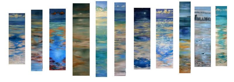
some people are like you Stuh and don't like the vertical format (remember not all my work is like this! just this series and for a particular reason - introducing the element of time passing) - but a lot do luckily Smile

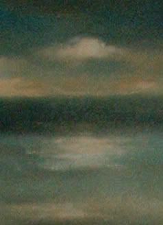
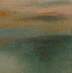
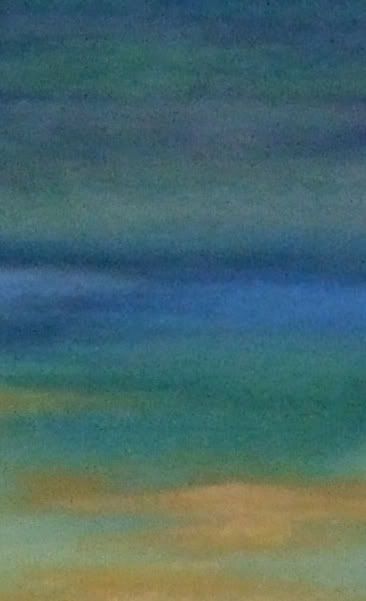
A horizontal long thin format has a very very different emotional and spatial effect and isn't at all what I'm after - the distance of the glistening pools and channels is what I want to work with - a horizontal look at the same view loses drama and is a much more calm and traditional look at the subject and doesn't, for me, catch the feeling of the place - this format or a square canvas or portrait format in 4:5 works much better.

They aren't done this way to be 'different' - long thin canvasses, triangular canvasses, irregularly shaped canvasses - it's all been done before by others, some work and some don't but there is a conceptual reason for the shape in these paintings.


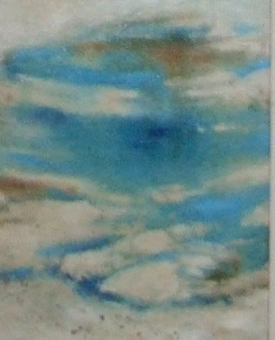
The abstract elements and repeating patterns that the water makes are crucial to me. I like the tension between the horizontal bands of colour and the vertical format - for me that works.

Also as Cypher points out - these are people sized and the impact in real life is very different from seeing them onscreen, tiny. You aren't seeing brushmarks and subtle glazes the same at all Sad They don't really work well on a smaller scale, they need to be this size - getting closer to 'sight size'.

NOT that I can compare to old masters but it's the same sort of issue - you see a reproduction of say a Rembrandt in a book and it looks good - you see the original in a gallery, large, life size people, made up of gloops and swirls and scumbles of paint that coalesce into lace and skin and it's a very different experience. Illustrational work doesn't lose anything onscreen or printed or reduced in size but 'painterly' paintings do Sad

so .... I appreciate your honesty and thoughts but don't agree Twisted Evil
0 Replies
 
msolga
 
  1  
Reply Fri 6 Jul, 2007 05:05 am
I love the idea, Vivien .... that sense of movement through time. And I really like the vertical format & the repetition .... perfect for the concept. I wish I could walk past the real thing/s in a big, empty, white gallery space!
You wouldn't have a cropped close-up photograph of a small section of one of the panels, would you? Always good to zero in & see the different textures, gloopy bits & colours up close. Smile
0 Replies
 
Vivien
 
  1  
Reply Fri 6 Jul, 2007 06:07 am
it's difficult to actually photograph close ups as the canvas sets up a weird interference pattern in the camera Sad but here are some closer ups that I did - none of the paint is terribly thick on these - so no gloops Smile. They are more about glazes and washes blending into each other.

http://img.photobucket.com/albums/v607/vivien/eseascapesjune2407007detail.jpg


http://img.photobucket.com/albums/v607/vivien/1moonrise11.jpg


http://img.photobucket.com/albums/v607/vivien/1moonrise11-1.jpg

http://img.photobucket.com/albums/v607/vivien/1wintermorning12x48insdetail.jpg


http://img.photobucket.com/albums/v607/vivien/1wintermorning12x48insdetail2.jpg


http://img.photobucket.com/albums/v607/vivien/1BlueDay8x50insdetail.jpg


I quite like the simplicity of some of these in their own right

I'm not, as is obvious! a photorealist fan - I can look at it and think it's clever but it only very rarely 'grabs' me like the work of artists like Kurt Jackson, David Tress, David Prentice, John Virtue et al I am trying to say more about the place than a simple copy of the scenes.


mmm that first image is a bit blurry, sorry
0 Replies
 
Vivien
 
  1  
Reply Fri 6 Jul, 2007 06:11 am
this artist is showing with me and I really like some of his work

colin halliday
0 Replies
 
msolga
 
  1  
Reply Fri 6 Jul, 2007 06:29 am
Vivien wrote:
I quite like the simplicity of some of these in their own right

I'm not, as is obvious! a photorealist fan .....
.......I am trying to say more about the place than a simple copy of the scenes.


I'll have no 2 on my wall anytime, Vivien! Very Happy

Really like those washes & how the colours & tones blend & bleed into each other. I get a real sense of how you work.

I totally disagree with Stuh. I find your treatment of the sky & water full of movement, life & atmosphere.

I'd love I could see them full size!
0 Replies


Related Topics

My grandfathers cameras - Discussion by shewolfnm
Quetzecoatal Returns to Mexico - Discussion by Asherman
Riding the Line - Discussion by Asherman
Monument - Discussion by Asherman
Coming of the Kachina - Discussion by Asherman
Shan An (Mountain Peace) - Discussion by Asherman
Corn Maiden - Discussion by Asherman
Canyons - Discussion by Asherman
Snake River - Discussion by Asherman
Godess - Discussion by Asherman
Asherman Art - Discussion by Asherman
 
  1. Forums
  2. » my latest series
Copyright © 2024 MadLab, LLC :: Terms of Service :: Privacy Policy :: Page generated in 0.03 seconds on 05/01/2024 at 08:37:13