8
   

Best Fantasy Drawings


farmerman
 
  2  
Reply Tue 25 Feb, 2014 10:37 am
@Setanta,
In my illustration classes, we were expected to do a portfolio of a selection of works in fiction and to do them "In the manner of"
I chose " Cannery Row" in the manner of Rackham. His work that I emulated was his Izaac Walton "compleat Angler" .IMHO His style was a neck and neck toss up with Howard Pyle in that they both most often used pen and ink and grisaille. I always wondered whether these two got on with each other(even though several miles and fathom apart)

Maxfield Parrish was almost a fine artist since he stylistically could have been a Pre Raphealite in his artistic style and in the way he chose the paragraphs he wished to illustrate.

One of the reasons Norman Rockwell never got a lot of book illustrating assignments, even though his style was eaten up by the public. He would pick aome really obscure phrases in books to illustrate and was always at odds with the editors and publishers and authors
0 Replies
 
farmerman
 
  1  
Reply Tue 25 Feb, 2014 10:41 am
@Setanta,
NC Wyeth had an almost childlike ability to laser in on the best sections of the books to illustrate , Like his picture of "Old Blind Pew" in Treasure Island.
It was amazing how, after an illustrator earned his chops in the "Golden Age " of Illustration, he would be left pretty much alone to choose and develop where in the books would be his illustration topics.
0 Replies
 
Setanta
 
  1  
Reply Tue 25 Feb, 2014 12:07 pm
Parrish was very much the innovator. This is from the Wikipedia bio:

Quote:
Parrish's art features dazzlingly luminous colors; the color Parrish blue was named in acknowledgement.[1] He achieved the results by means of a technique called glazing where bright layers of oil color separated by varnish are applied alternately over a base rendering (Parrish usually used a blue and white monochromatic underpainting).
He would build up the depth in his paintings by photographing, enlarging, projecting and tracing half- or full-size objects or figures. Parrish then cut out and placed the images on his canvas, covering them with thick, but clear, layers of glaze. The result is realism of elegiac vivacity. His work achieves a unique three-dimensional appearance, which does not translate well to coffee table books.

The outer proportions and internal divisions of Parrish's compositions were carefully calculated in accordance with geometric principles such as root rectangles and the golden ratio. In this Parrish was influenced by Jay Hambidge's theory of Dynamic Symmetry.

Parrish devised many innovative techniques. A technique which Parrish used frequently involved creating a large piece of cloth with a geometric pattern in stark black-and-white (such as alternate black and white squares, or a regular pattern of black circles on a white background). A human model (often Parrish himself) would then pose for a photograph with this cloth draped naturally on his or her body in a manner which intentionally distorted the pattern. Parrish would develop a transparency of the photo, then project this onto the canvas of his current work in progress. Using black graphite on the white canvas, Parrish would painstakingly trace and fill in all the black portions of the projected photo. The result was astonishing: in the finished painting, a human figure would be seen wearing a distinctive geometrically patterned cloth which draped realistically and accurately.


In the Wikipedia article, the posted his "Cadmus sowing the dragon's teeth[/i] as an example.

http://upload.wikimedia.org/wikipedia/commons/9/9c/Cadmus_teeth.jpg

This page at "lines and colors-dot-com" has an interesting brief summary of Parrish' technique.
farmerman
 
  1  
Reply Tue 25 Feb, 2014 12:42 pm
@Setanta,
He did a work called the "Garden of Dreams " as a painting that Tiffany Studios had converted into a huge mosaic of small opalescent glass pieces. It stands in Liberty Plaza in Philly.

0 Replies
 
izzythepush
 
  0  
Reply Tue 25 Feb, 2014 12:51 pm
When I was a kid I was into Hawkwind. They had some pretty amazing album covers.
http://www.collectable-records.ru/images/GROUPS/HAWKWIND/Warrior/full_fr.jpg
http://upload.wikimedia.org/wikipedia/en/3/3e/Hawkwind-mountaingrill.jpg
0 Replies
 
Olivier5
 
  1  
Reply Tue 25 Feb, 2014 06:30 pm
Enki Bilal, mostly a 'BD' artist, did some cool illustrations for scifi novels:

http://2.bp.blogspot.com/_BAPC4QJMEP0/TCmLFyWDQtI/AAAAAAAAF70/AAgHPVVzWSA/s1600/visioni_p093.jpg
0 Replies
 
Aldistar
 
  1  
Reply Tue 25 Feb, 2014 10:15 pm
Julie Bell has been one of my favorites for her comic work.
http://t3.gstatic.com/images?q=tbn:ANd9GcSTyZtP9diTqai-TXFRoR47O-xpQ0aSHH-uol-PzXlGunokMZmj

http://25.media.tumblr.com/tumblr_m2qg6c26aP1qhpx4lo1_1280.jpg

Frazetta is awesome. I got the chance to go to his home/museum on a field trip for school. We spoke at great length with his wife, but he was not in town. I have one of his prints hanging in my home.

http://frankfrazetta.org/images/frank_frazetta_darkkingdom.jpg


My favorite, however, is Mucha. His work is a great inspiration to me.

http://one1more2time3.files.wordpress.com/2013/06/2alphonse-mucha-the-seasons-1897.jpg


farmerman
 
  2  
Reply Tue 25 Feb, 2014 10:35 pm
@Aldistar,
AHHHH, Alfons. Ive always considered him the best of the Art Nouveau painters. I have a copy of his JOBS cigarette paper poster in the studio,

Great Stuff. Were you a student of one of the Pa colleges near the Frazetta museum.
farmerman
 
  1  
Reply Wed 26 Feb, 2014 11:10 am
@farmerman,
AHa, found it. Hres the JOBZ ciggy paper poster by Alfonz Mucha that probably did more to define the art nouveau style from which he continually tried to dis associate himself. The more he bitched that he was merely a Czech artist with Czech style in mind, he would be remembered as much as any of the greats in the A.N., Arts n Crafts, and Art Moderne.

I have a facs of this poster in my studio . These are the "Girls with the pastaferous hair"

 http://t3.gstatic.com/images?q=tbn:ANd9GcRqRsyLxiPUT3CRLMDCLOxmIAdaepksgPpdNhzmsSlEv3w4WtV1zw
Aldistar
 
  1  
Reply Wed 26 Feb, 2014 09:08 pm
I graduated from The Joe Kubert School of Cartoon and Graphic Art in Dover, NJ. A bit of a bus trip , but it was very interesting.

I have a coffee table book of Mucha's art and love flipping through it. I am planing a series of zodiac paintings imitating his style.
izzythepush
 
  0  
Reply Thu 27 Feb, 2014 02:19 am
@farmerman,
That looks similar to this, I have one up in the lounge.
http://fc01.deviantart.net/fs12/i/2006/296/4/b/Absinthe_Robette_Poster_by_caioneach.jpg
farmerman
 
  1  
Reply Thu 27 Feb, 2014 09:51 am
@Aldistar,
cool. I see that entire Nouveau gene gathering some sort of a resurgence of interest.
Muchas colors were always carefully orchestrated so that some focal point would contain some or all of their hair
0 Replies
 
Olivier5
 
  2  
Reply Thu 27 Feb, 2014 02:17 pm
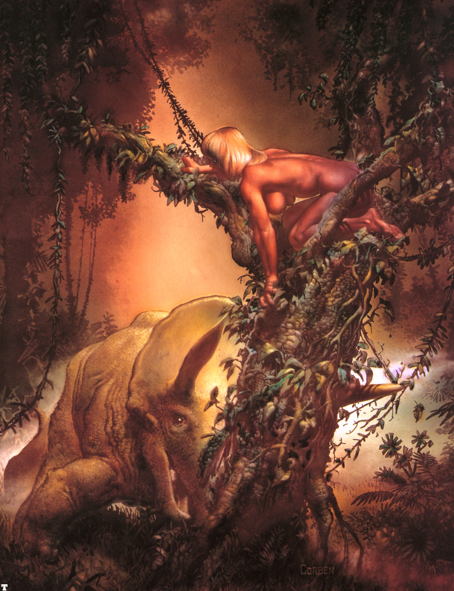
In the team around Moebius and Druillet, who founded in the 80s a publishing house called Les Humanoïdes Associés and published the magazine Métal Hurlant (francised in the US as "Heavy Metal"), there were also Richard Corben and Gaetano Liberatore, two great painters of human beauty, scifi and fantasy.

Liberatore recently did a splendid book illustrating the life of a female australopitecus, based on sound science: Lucy, L'Espoir. Very little text in there, but many gorgeous drawings.
http://anthropologynet.files.wordpress.com/2007/12/lucy-lespoir-norbert-liberatore.jpg

I used to love Corben, not least because of his sense of dark humor. The guy could invent and tell a great story, not just illustrate it wonderfully.
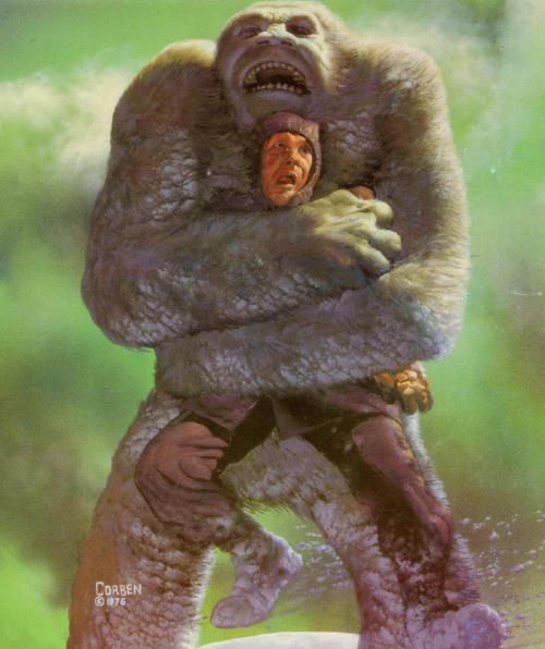
http://31.media.tumblr.com/tumblr_mavnzgTLd51qmg4b2o1_500.jpg

http://3.bp.blogspot.com/-bkSs2IzX3XE/Th5Mv3Ro2mI/AAAAAAAABNI/fSi-jZ0mW-Q/s1600/richard_corben_treed_by_triceratops.jpg
panzade
 
  1  
Reply Thu 27 Feb, 2014 02:33 pm
@Olivier5,
cool stuff
Olivier5
 
  1  
Reply Thu 27 Feb, 2014 03:27 pm
@panzade,
Thanks. Big Corben fan here... Fantasy doesn't need to be cliché-ridden although for some reason it often is. Corben pushed the envelope a lot. He made the genre more "undergroundy" and funny than it used to be.
farmerman
 
  1  
Reply Thu 27 Feb, 2014 03:34 pm
@Olivier5,
Not familiar with his work . Thank for sharing that, Ill be a fan I can see.
Germlat
 
  1  
Reply Thu 27 Feb, 2014 03:42 pm
@farmerman,
Beautiful !!
0 Replies
 
Germlat
 
  1  
Reply Thu 27 Feb, 2014 03:43 pm
@izzythepush,
Gorgeous too!
0 Replies
 
Olivier5
 
  1  
Reply Thu 27 Feb, 2014 04:06 pm
@farmerman,
Most welcome. Of course his work was primarily meant for teenagers, and I was a teenager when I read him... Lot's of big boobs and fist fighting in there -- don't expect too much psychology... I liked his "Mutants" more than the many albums on Den's adventures, but the latter were loads of fun too..

Liberatore's Lucy is fascinating both graphically and intellectually. It puts the reader in the mind of a pre-human facing a series of dangers and situations. Its tone is very touching and humane, though not anthropocentric. I don't think it's been translated in English yet but it could be, as the French version made an absolute killing.
farmerman
 
  1  
Reply Thu 27 Feb, 2014 07:23 pm
@Olivier5,
Im familiar with the Lucy work. I liked the use of primary colors in the illustrations.
 

Related Topics

 
Copyright © 2025 MadLab, LLC :: Terms of Service :: Privacy Policy :: Page generated in 0.03 seconds on 01/22/2025 at 08:20:47