Reply
Wed 29 Aug, 2007 03:24 pm
We're swapping the office with the nursery, because we like to move furniture for no damn reason.
I get to pick paint for my new location, however.
I'm thinking something warm but rather neutral. Walls are textured. I'd like to do something more than just roll on single color; anyone have favorite painting techniques?
Add'l details:
Carpet is beige. Doors and trim are glossy beige; I don't intend to redo all of that.
My desk will have a birch top and silver legs.
I'd like some color, but I'm terrible at it. Color deficient, ya know.
It's a fairly small room. Sherwin-Williams says to use green or blue to make it seem bigger....
Sounds like you've got some Ikea-ish/Scandinavian basics, so I'd be lazy and look in that direction.
Modern/traditional/cottage style/mood?
"Desk" is from Ikea, actually.
Office chair.
Laptop.
Monitor/keyboard/mouse....
Family photos.
All the basics of the cubicle, without the charm of fabric-covered walls.
Looking for help with inspiration as to possible color schemes....
I'm a fan of color, and past that, coordinating colors in a house, not always obviously. My last computer room/office was painted a vintage rose; that is, a fairly strong red-purple, somewhat "greyed". Given all the stuff that fills an office, the heavy color, whatever color, won't be so overwhelming as it seems when the room is just painted and empty of "stuff".
On my present house, I'm playing with colors with lighter presence - sort of wheaty golds, grey-greens, peachy blondes. Damn, what is that zingy purple doing in there... well, maybe for a pillow. Some light greyed coral..
So, I have a favorite paint company, though from other threads about this I'm learning of other interesting paint companies. My present fav is Benjamin Moore for the paint quality. But, you can take any paint color sample, and have your hardware store match it for color, if not for quality. Some of the higher end companies sell sample small bottles, so you can test colors on the wall.
Given my old business that sometimes involved suggesting colors to clients, I had thick color "books". Now I just go to some stores and grab color chips that catch my eye, with more than one chip of the ones I like best, and try them out on the wall, looking at the chips at different times of day/light. Given you narrow it down, you can get a quart mixed for you and splash it on, see if you like or hate it.
Color really can affect mood, in my opinion. One can also get sick of a color. Luckily, paint color is one of the easiest things to change in a house and bears the most impact.
So, you can say "she's as nutty as I've always thought", but I'd suggest taking something like
a Portuguese Lucky Rooster as your inspiration.
White, medium/lightish blue, neutral wood, silver - and hits of bright red/yellow/deep blue.

Would you be ok with medium blue walls?
ossobuco wrote: that catch my eye
I've been waiting for weeks for that, but it hasn't happened. Deadline approacheth. Must... make... decision....
just discovered that the Swedes and Italians have similar good luck/good fortune rooster ceramics - you could tell people your room is based on ... whatever culture you're feelin' that day
howsabout this colour wall - a blued-grey thing

looks good with a lot of woods/neutrals - something to bounce brights off of
(where's kicky? he's got a marvellous sense of colour - don't tell him I said so)
hmmmmm - that's a bit too A2K-y on my monitor
those paintings look great on that blue/gray wall! i like that combo.
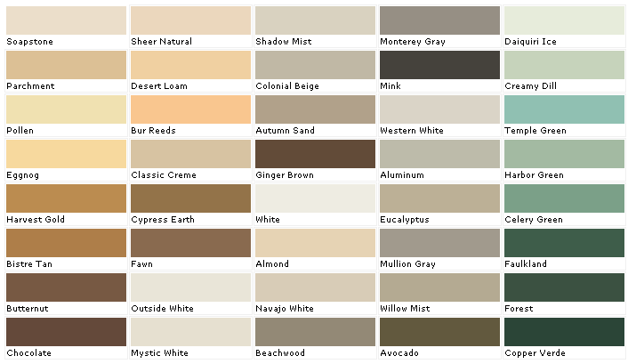
DD, what kind of a beige is that carpet? almost gray? or warm beige? brownish?
any of these come close to the carpet and the door frame?
We have used a medium blue (called, I think "Connecticut Blue") with taupe trim in a bedroom with all wood finish furniture ranging from mahogany to oak. We also used it on a wall in a two storey foyer, with oak bannisters, light grey floor tiles in the entryway and "sand" coloured stair steps. I like the fact that it doesn't "fight" with either the grey nor the sand colours. It's very versatile -- similar to the colour on the rooster ehBeth posted -- just a little darker.
Out of dagmar's color chart I like Parchment.
i like that, too. also harvest gold, but that would come out dark on a whole wall.
green is considered a colour to aid concentration. Is this room for thinking -- or wasting time?

It's quite restful, too.
Um, I like Pollen and Parchment and Eucalyptus...
I had a room painted a similar color to Beth's museum photo - a small room with a lot of white woodwork and great windows. Had one of my big paintings of a field, forest, and horse in there. The room looked great. Grey blue can be too, er, sullen - it needs to have some brightness to it, and the one wasn't leaden..
I went looking for color charts...
I like Ben Moore, but their site annoyed me with lack of color chart...
Went to Sherwin-Williams and found
this, click launch color visualizer.
I don't know if it would be helpful, but it is fun!
(I like the blue idea)
Yeh, I liked a couple of the lighter greens too. Some people hate green, some like it - I like it.

hmmm, that's starting to look like Ebeth's....