Reply
Tue 27 Feb, 2007 09:50 pm
Sketch I did today of a friend...it was done as a warmup for a "good" digital painting. This is attempt #3, I imagine I'll do a few more before starting on the real thing, but I rather like this one too.
Note: it actually looks best if you stand about 10 ft back but I understand if your seat is planted


Wow that was fast, thank you!
Did you erase her upper lip? Or is that a shadow?
No, it's washed out on purpose but that's a good point, it lacks depth. How's this..

I meant the line above her upper lip - sorry. There is shading up there, but also something that almost looks like a pencil thin mustache.
Yeah. That line is to suggest the upper boundary of the lip. It would not really appear as an intensity edge but it is necessary because I did not go into detail on the texture of the lips. It doesn't bother me this way, but I do appreciate your comments because I like this version better.
That's the kind of thing I would change in the real painting where I go into intimate details of skin texture
I like it, too.
When I first looked at it, I thought that line that littlek's talking about was wrong too. Then I realized that it's the upper edge of the upper lip -- I was reading the teeth as the upper lip (closed mouth instead of open). So defiinitely do some correction there. If the light is bright enough to wash out the lip detail, then the teeth shouldn't be so delineated. Or, conversely, deepen the tone of the underside of the upper lip.
Wow, you're really talented.
Thanks guys. Stay tuned for the painting.
The shading on her right cheek (left side of image) is very nicely done.
uhhhhh...... could i have her phone #?
:wink:
Stuh, I see you haven't lost your touch. I rolled my chair back and it is as wonderful up close as ten feet away. I particularly like the sepia tones.
Thank you Letty. Ok guys here is an update...I like how it is coming out. I don't think it is done yet though.

Here's my todo list:
-redo the nose it is too big
-fix sizes of the teeth
-add eyelashes to left eye
-create more detail in iris (possibly)
-increase definition in eyebrow hairs
I'm kinda partial to the more abstract version. But if you're going for realism, I think the nose appears to be pushed a little too far to the left.
Still, very good.
Same here. The sketchier version was more forgiving of inconsistencies. There's some twistiness that isn't right -- eyes/ nose, nose/ mouth, mouth/ neck, etc.
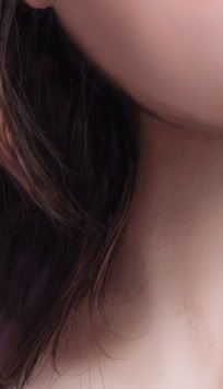
This section especially doesn't work right now:

In the sketch it was just kind of shadow, your eye could get the proportions right, but in this more articulated version the edge of her neck is much too far to the right and her neck seems way too skinny.
Yeah I'm noticing a lot of stuff like that when I flip the canvas, so I'll get around to it. Thanks for comments