8
   

Logo design -- offensive or not?


Wed 12 Jun, 2013 06:16 pm
I'm not a graphic artist but I have been dragged into designing a logo and some T-shirts for a sports team.

The initials of the league are WYF. So I designed the "Y" to look like goal posts, complete with a ball going through the goalpost. The "Y", to me, not only looks like a goalpost but like a referee signaling a touchdown. It has the league name spelled out beneath it.

Everyone liked it, amateur as it is (hey, you get what you pay for).

Then they asked me to come up with some T-shirt designs. I've been working on a few ideas but I'm worried that they logo looks too much like "WTF".

I like it in a tongue in cheek sort of way but I'm worried people would be offended.

Here's a rough draft of one idea:

http://img.photobucket.com/albums/v667/boomerangagain/wyfeasytshirt_zpsbb0f4f15.jpg

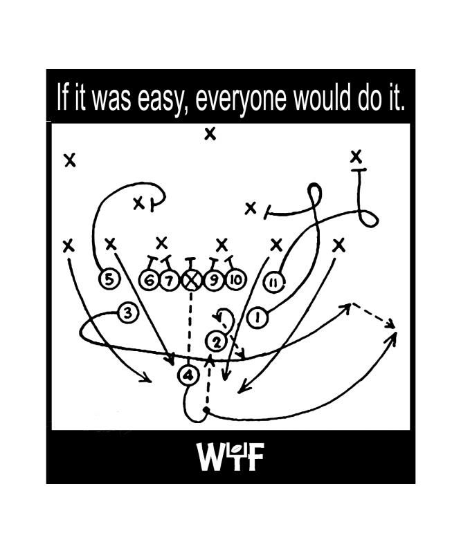
Is it too WTFish? Okay or not okay?

 
roger
 
  2  
Wed 12 Jun, 2013 06:45 pm
@boomerang,
My personal feeling is that it will only be offensive to that class that seeks out new ways to be offended. If you run into some of them, you might suggest it's only offensive to those with dirty minds. That might hold them long enough to take a deep breath and reconsider their perceptions.
boomerang
 
  1  
Wed 12 Jun, 2013 07:41 pm
@roger,
Thanks, roger.

There are a lot of people who look for ways to be offended and I know my sensibilities can be a little.... ummm... ribald... so I make sure to double question myself on things like this.
ossobuco
 
  2  
Wed 12 Jun, 2013 07:47 pm
@boomerang,
I like it. You're good at this.

Edit - I don't know the population characteristics in your town, re people being offended about this, but I'd be surprised. WTF doesn't come to mind even to me.
farmerman
 
  3  
Wed 12 Jun, 2013 07:58 pm
@boomerang,
WTF is so impressed into our culture that you wont scape it so outside of the occasional references you will get , I think it works fine. Maybe yoy want to paint each letter a different color like red white (for the goal posts) and then blue

put diagonal stripes on the uprights and cross bar
boomerang
 
  1  
Wed 12 Jun, 2013 08:14 pm
@ossobuco,
Thanks, osso. That means a lot coming from you.

Our population has as many sticks up their ass as any other small city does.

The "WTF" aspect struck me but I kind of thought it was funny. I worry about others. The team needs to raise some money and I don't want to make it harder on them.
0 Replies
 
boomerang
 
  1  
Wed 12 Jun, 2013 08:15 pm
@farmerman,
Goal posts have color schemes?

What I know about football could fit in a thimble (which makes this "assignment" particularly difficult for me).

I'll look into that!

Thanks!
farmerman
 
  2  
Wed 12 Jun, 2013 08:17 pm
@boomerang,
usually the stripes on a goal post are just so you can tell em from an aardvark in the field. They are usually just black and white diagonas
ossobuco
 
  1  
Wed 12 Jun, 2013 08:22 pm
I guess my only question (I like farmer's diagonals take) is where'd you copy the play diagram from (does that need credit? or could you diagram the play differently> don't look at me)
boomerang
 
  1  
Wed 12 Jun, 2013 08:26 pm
@ossobuco,
I can get a play from the team's coach to use. I was just trying to come up with some ideas to present them so I used on I found online.

Everything I did today is still in it's rough from -- including the logo. I didn't want to spend hours and hours on something and then have it rejected.
0 Replies
 
boomerang
 
  1  
Wed 12 Jun, 2013 08:26 pm
@farmerman,
Good to know!
0 Replies
 
Baldimo
 
  2  
Thu 13 Jun, 2013 01:04 am
@boomerang,
When I was reading it, I wanted to read WTF but it wasn't there.

I have a shirt on it that reads WTF. What the Frak. It's a BSG shirt. I wouldn't worry about it to much, haters gonna hate!
boomerang
 
  2  
Thu 13 Jun, 2013 07:31 am
@Baldimo,
Thanks. I'm going to quit worrying about the WTF aspect of it!
Baldimo
 
  1  
Thu 13 Jun, 2013 02:20 pm
@boomerang,
For a softball group it should be fine. Now if you were designing shirts for a church group, it would be a different story.
0 Replies
 
RealEyes
 
  1  
Thu 13 Jun, 2013 11:05 pm
@boomerang,
WYF are you talking about? It's perfectly fine.

Cheekiness aside, it's an acronym. Even if someone were to mistake "wyf" for "wtf" who is to dictate is necessarily means "what the f&%#?" For the more pesky critics, you could say it means "way to fly!" referring to the football or [insert similar semantical spinnery here].

To be perfectly honest, it depends how your brain is programmed. You undoubtedly use "wtf" in your text speech, and thus your brain immediately tries to find that pattern. I didn't notice the similarity and didn't misread WYF on first glance of your graphic design. Whether I'm texting or typing on a computer, "wtf" isn't part of my regular vernacular. It didn't pop out at me. This will be a similar story for people like myself.

I wouldn't worry about it, to be honest.

The only thing you could do to balance it is make the w more uniform with the y. Make it into " |_|_| " emphasizing the 90' angles.
0 Replies
 
cpabeyond
 
  1  
Tue 18 Feb, 2014 12:16 am
@boomerang,
I like your design. It looks good.
0 Replies


Related Topics

Should cheerleading be a sport? - Discussion by joefromchicago
Are You Ready For Fantasy Baseball - 2009? - Discussion by realjohnboy
tennis grip - Question by madalina
How much faster could Usain Bolt have gone? - Discussion by Robert Gentel
Sochi Olympics a Resounding Success - Discussion by gungasnake
 
  1. Forums
  2. » Logo design -- offensive or not?
Copyright © 2024 MadLab, LLC :: Terms of Service :: Privacy Policy :: Page generated in 0.04 seconds on 04/19/2024 at 04:10:11