8
   

Request for Timeline.


Reply Sun 17 Aug, 2008 01:17 pm
So, like many here, I am unhappy with some of the changes to A2K.

It isn't that this is unexpected; whenever change occurs, people are going to be upset for various reasons. But what gets me is that many of the changes have made the site worse and harder to use. It's difficult to see why these changes were made. The usability of the site has suffered considerably.

My question is, is there any way of knowing if these items will be addressed at any point? I don't want to stop coming to A2K, but there are some changes which are so damn annoying I'm tempted to stop.

Rather then put an entire list of complaints here - which would only replicate other lists - I just want to ask a question: at what point was it decided that making users do extra work to accomplish the exact same tasks, was good usability? Upgrades should make things easier to use, easier to find, and more fluid. Many of the changes to A2K have done the exact opposite of this. There is less information on the screen at one time then there used to be - by a lot! Much of the screen space is purely wasted. Here's an example - everything in the red box is truly wasted.

http://farm4.static.flickr.com/3269/2771154791_45bff1f200.jpg

That's almost a third of the screen, given over to nothing at all!

Why can't we have the old way, where different columns gave useful information and used the entire space on the page? This allows one to see more topics at one time.

I could go on, but to sum it up: every time you have to scroll, it's bad. Every time you have to click 3 times to do something that used to take 1 click, it's bad. Every time I can't find a topic, because the new 'tagging' system really isn't as great as some seem to think, it's bad. It's difficult for me to see how anyone could have thought these were positive changes, to make things MORE difficult for users.

Now, are these things going to be fixed, or not? Is there a timeline for possible upgrades to the site? I ask because I really love posting here. I have made this my primary discussion site for several years now. I click on ads. I am what you would call a dedicated user, with 15-20 posts per day on average. But many of the changes have reduced the usability of the site to the point where I feel frustration, and that makes me not want to post here.

So: is there a timeline? If there isn't any real commitment to fixing issues that long-time users raise, then I'm going to start looking for another place to post. Now, I know that the response from many is 'see ya.' And I understand that response. But I feel quite sure that there are many others who feel the same way about it and I KNOW the volume of posting (in politics forum, at least) has dropped off tremendously. Please help retain long-time users by making EVERYTHING as easy as it used to be, at the very least! Forcing people to do additional steps is a mistake and will cost the site in the long run.

Cycloptichorn
  • Topic Stats
  • Top Replies
  • Link to this Topic
Type: Discussion • Score: 8 • Views: 10,405 • Replies: 83

 
Seed
 
  1  
Reply Sun 17 Aug, 2008 01:27 pm
maybe an option to have a "traditional" view of a2k in the options and preferences of the site
0 Replies
 
sozobe
 
  3  
Reply Sun 17 Aug, 2008 01:33 pm
@Cycloptichorn,
This doesn't really address your core concern but it does kind of, too.

Your screenshot doesn't have a lot to do with what *I* see. What I see is this:

http://i34.photobucket.com/albums/d130/sozobe/screenshot.jpg

Not a lot of wasted space.

I think there are a whole lot of different concerns and a whole lot of weighing/ juggling going on. This makes things easier for this (for example, a couple of people have said that A2K works much better on mobiles now), but this same thing makes things worse for this. Etc. I expect that will gradually shake out to equilibrium. But of course not everyone will be happy, period.

Cycloptichorn wrote:
Every time I can't find a topic, because the new 'tagging' system really isn't as great as some seem to think, it's bad. It's difficult for me to see how anyone could have thought these were positive changes, to make things MORE difficult for users.


Doesn't this seem really subjective? I am genuinely enjoying the tags. A lot. If you think it's not as great as I think it is, then... what? What is Craven supposed to do about that, realistically?

He's supposed to "fix" it?

It seems like you're asking him to "fix" things that you don't like -- even when other people do.

I find the current site way easier to use and more fluid, right now. The two things that consistently bother me are a) lack of search and b) lack of read tracking (marking what I have and haven't read). Craven's talked about doing something about both of those things in the future. Going by the lead-up to this site (which was imminent for about two years), I really doubt you're going to get a timeline.

I personally would be distressed if that's enough to chase you off, though.
InfraBlue
 
  1  
Reply Sun 17 Aug, 2008 01:42 pm
I think Cyclo made a screen shot of a page before the ads were added to the site.
I was wondering where they had gone when the new site first launched.
InfraBlue
 
  1  
Reply Sun 17 Aug, 2008 01:44 pm
@sozobe,
Quote:
b) lack of read tracking (marking what I have and haven't read).

In my browser, the color of the linkable text changes after they've been clicked. That's how I know I've read, or at least clicked on the links to, the threads.
0 Replies
 
Cycloptichorn
 
  0  
Reply Sun 17 Aug, 2008 01:44 pm
@sozobe,
I shouldn't have to re-adjust my text size every time I come to the site in order to make it usable.

It isn't that I think tags aren't useful - they are. It's that tags have been used to replace the forums. I don't think this adds usability in the slightest. You didn't have to add an extra step to post in the politics forum - you just hit 'post.' You didn't have to search through a long list of unalphabetized (yes, I've heard the excuses for why it can't be alphabetized, most of which I don't agree with , but whatever) tags to find what you are looking for.

I understand that some people like the new site and the new features; there are many things about the new site that I like as well. But these things are subdued in my mind, because of the extra steps that it takes to do the exact same things I used to do! It's wasted time on my part, which I detest.

I've been involved in website creation and User Interface design for a few years, and I can tell you that a prime rule is to not make things more complicated then they used to be when you upgrade something. It just doesn't make any sense at all to do so.

I really wonder - what is it you find 'easier to use?' What takes less clicks or scrolling then it used to? It seems to me that nearly every operation here takes more time and effort then it used to, and it's difficult to see the reasoning behind why it was done this way.

Also, some aspects of the new site aren't at all clear - what tag should this post have been given? How am I to know that others will know to look under this tag? I've been looking around for some of the 'primer' or other posts that have been made to introduce people to the new site, and they are hard to find! They should be easy to find!

Tags are not a replacement for actual organization. They are a neat idea, and a useful tool; but they don't give the same experience as what we had before, and that is a loss to me in many ways.

Cycloptichorn
Cycloptichorn
 
  0  
Reply Sun 17 Aug, 2008 01:46 pm
@InfraBlue,
Quote:
I think Cyclo made a screen shot of a page before the ads were added to the site.
I was wondering where they had gone when the new site first launched.


I have no ads on the site at all. And even counting the ad space, there's still a huge amount of wasted space on the page, and no real reason for it.

Cycloptichorn
mushypancakes
 
  2  
Reply Sun 17 Aug, 2008 01:46 pm
@Cycloptichorn,
I'm feeling the much the same way. But essentially, for me, it is boiling down to the fact that I enjoyed the old format a whole lot more.

Now, some of it may be simply getting used to a new system. It annoys me to be honest to have to learn so much here simply to do what is to me, very simple posting.

I typically do not like to use a lot of features. Bare bones. I want it simple. I want lots of information all there at once. And I want it in a different format. I don't want to use it on my mobile. I don't want to spend a bunch of time customizing.

I come to respond and start topics of interest, and that is it. To find certain people too and keep in the loop.

Realistically, there is nothing that can be done about this and I don't expect things to change a whole bunch just because I don't like it. It's not going to happen.

But I do understand where you are coming from. I'm considering tapering off usage and even leaving. If it's "see ya", ok. On the other hand, I do enjoy the community here a whole lot. And the minds.

I don't think we'll get the answers we like, or the changes we'd like. It is sort of put up or shut up.

I mean this is no way to disregard the hard work and idea behind all this change, or the people who are making it happen. People here are generally fair, reasonable, and take time to address above and beyond what I'd expect in a public forum.

But....yes...it's a bit frustrating. I feel like I've lost the place I once liked so much. Too bad, so sad.
0 Replies
 
sozobe
 
  2  
Reply Sun 17 Aug, 2008 01:51 pm
@Cycloptichorn,
Cycloptichorn wrote:
I really wonder - what is it you find 'easier to use?' What takes less clicks or scrolling then it used to? It seems to me that nearly every operation here takes more time and effort then it used to, and it's difficult to see the reasoning behind why it was done this way.


Well, it's a new paradigm. It's not just an upgrade of what was already there, it's a whole new way of doing things.

I never operated out of forums; I operated out of "new posts." Forums were irrelevant to me, so no particular difference there.

I love being able to focus my browsing after I've been away for a while and have a lot to catch up on, by, for example, seeing what threads nimh has tagged. Seeing what threads Craven has posted in.

I love being able to "bookmark" threads I don't currently have anything to say about without writing "bookmark" -- just tag 'em, and they're in "My Tags."

I love all the ways to sort threads; new posts is my usual, but if I'm curious about what people are reading, "most votes" has often gotten me to interesting stuff.

Etc., etc. I'm not sure you want the whole list, though I'm willing to give it -- hopefully that answers your question sufficiently.

Cycloptichorn wrote:
I've been looking around for some of the 'primer' or other posts that have been made to introduce people to the new site, and they are hard to find! They should be easy to find!


Have you tried clicking on the "able2know" tag?
0 Replies
 
cicerone imposter
 
  1  
Reply Sun 17 Aug, 2008 01:54 pm
What happened to all the ads? They just disappeared this PM.
0 Replies
 
hawkeye10
 
  -2  
Reply Sun 17 Aug, 2008 01:55 pm
@Cycloptichorn,
The tag system does make it possible to customize the site, but ease of use for people not committed to putting in the work has gotten worse as you note. It remains to be seen how this change works out so far as drawing new members in, it would seem obvious to me that it makes recruitment more difficult.

I do think that there were other agenda's, such as maximizing the ability to bury and ignore stuff that we have predetermined that we don't want to see. Using tag technology to self limit our exposure to others seems like a misuse of technology to me, especially when it is done at the cost of adding complexity, but obviously Craven does not agree.
0 Replies
 
sozobe
 
  2  
Reply Sun 17 Aug, 2008 01:55 pm
@Cycloptichorn,
Cycloptichorn wrote:
I have no ads on the site at all. And even counting the ad space, there's still a huge amount of wasted space on the page, and no real reason for it.


...that you know of.

Some reasons I can think of (note, this is just based on what I've seen Craven say, what I've seen here from other people, and my own conjecture -- absolutely not to be taken as anything definitive):

- Less stuff on the screen = easier to use on mobiles
- Some people like how it looks, graphically-speaking (Boomerang and osso have commented on this, for example)
- The space is meant to be taken up by ads. Just because you don't have ads for whatever reason (ad-blocker?), that'd be a good reason for why the space needs to be there, since the financial backing for this site comes from ads.
0 Replies
 
yitwail
 
  1  
Reply Sun 17 Aug, 2008 01:58 pm
in another topic, Chumly posted a lot of relevant questions i thought, in a constructive way, but the topic has a negative score, so not too many people may see it, including Chumly himself. so allow me to insert a link to my reply to his post. & please feel free to read my post after the reply, where i offer a couple of workarounds--the workarounds may have been noted elsewhere, but right now it's not so easy finding them, so i hope i'll be excused any redundancy.

http://able2know.org/topic/121032-3#post-3362189
oh, and maybe click Fit to Post after navigating there, so you can see Chumly's post i quoted.
sozobe
 
  2  
Reply Sun 17 Aug, 2008 01:59 pm
@yitwail,
Here is the able2know "forum":

http://able2know.org/tag/able2know/

(Really, all of the threads tagged with "able2Know.")

I think you guys will find most of those kinds of threads there. If you know of more that aren't, go ahead and tag 'em with "Able2Know" and they'll show up there.
Thomas
 
  2  
Reply Sun 17 Aug, 2008 02:02 pm
@Cycloptichorn,
Since you don't want to discuss a list of specifics, Cycloptichorn, my comment is simply this: Give it time. I had a fairly negative reaction to the changes at first, too. But as I discover the new possibilities of tagging, and ways to work around annoyances in the new system, my negative reactions are subsiding, and I'm getting pretty enthusiastic about some other stuff.

(Off to dig through my favorite correspondents' old threads and tag them.)
0 Replies
 
Craven de Kere
 
  4  
Reply Sun 17 Aug, 2008 02:05 pm
@Cycloptichorn,
Quote:
The usability of the site has suffered considerably.


I actually disagree, it might not be what you are used to but I think the usability is vastly improved over the last site. Forum software has no examples of great usability at all, people are just used to them.

I'm a bit of a usability nut, and it's just my pet peeve to see people express their confusion as a matter of usability, not that I think this site is usable enough (not even close) but more that they really don't know what constitutes usability in web development so it just means it confused them (which given the navigation habits to change is inevitable so hard to differentiate from real usability issues).

Quote:
My question is, is there any way of knowing if these items will be addressed at any point?


I'm not good at predicting things, and would rather not try to commit to timelines I probably won't be able to keep. I can say that we'll address what we can as fast as we can but that it won't always be what you'd wanted (can't make everyone happy).

Quote:
..at what point was it decided that making users do extra work to accomplish the exact same tasks, was good usability?


I think you are being unfairly sarcastic, and I think you know that this is a loaded question. Of course no such decision was made, but if you give me specific examples of the extra work I'll be happy to tell you why it's that way now and if it is likely to change in the short term.

Quote:

Upgrades should make things easier to use, easier to find, and more fluid.


Sure, and it'd also be great to have a ton more money to pay for more development time and more testing. But I'm doing what I can with the resources I have. We are launching rough, like I warned we would. I don't think it's nearly as bad as you seem to though.
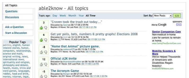
Quote:
Many of the changes to A2K have done the exact opposite of this. There is less information on the screen at one time then there used to be - by a lot!


This is what I mean by my frustration about "usability" critiques that don't fundamentally understand usability. There are vastly different use patterns for the site, and for the 5% of hard-core users more information is generally the preference. For the rest, less is more (in general).

So developers need to follow something like the 80/20 rule to make very usable sites for brand new users (as opposed to existing users used to specific features). See here: http://www.usabilityfirst.com/glossary/term_498.txl

Quote:

Much of the screen space is purely wasted. Here's an example - everything in the red box is truly wasted.


You do realize that screens come in different sizes and for those on smaller resolutions that whitespace doesn't exist? And you do realize whitespace has a strong place in usability?

We have some things we are working on to better support the differences in screen resolutions (for example there is a non-liquid layout we already have but need to test more for release) but the bottom line is that the old site caused horizontal scrolling for many users on lower resolutions than you. This kind of change is an example where we improved the usability overall but caused more whitespace than you would like.

In any case, we do have plans to make things better, but I think this kind of criticism is a much ado about nothing. You can't realistically make the case that the whitespace is making much of a difference in your use. Sure, you can make the case that not having the last post username or read tracking is getting in your way but that's not a design decision but merely features we aren't done with yet. Even when they are added if we support low resolution browsers higher resolutions will have more space.

You were familiar with the old grids, but quite frankly they didn't have much "usability" to speak of. They were cluttered grids with a mess of icons and links without indicating which was the most relevant one (for example, the first one was the forum link, which is less important than the next column's topic link). This format is actually much more user friendly for the 80%, but lacks some of the power shortcuts for the power users.

We'll add them, but may be as preferences you enable to keep it simpler for new users. But my point is that what you are saying is "usability" is for your specific use pattern and the extra options make it less usable for less experienced forum users.

Quote:
Why can't we have the old way, where different columns gave useful information and used the entire space on the page? This allows one to see more topics at one time.


For the same reason Google, for example, doesn't put their search results in table columns. It's horrible usability. The columns just divided all the white space up making it require more overall and without anything to focus on. In addition some of the columns don't really exist in the same way (like the old "forum" column).

Now I do think that your criticism is rooted in some fundamental usability truth (even if it's not expressed once that way) . For example, not having the last post username makes it hard to tell if the last post is the one you just made or a new one. Or for example, the lack of "forum" for the topic, so "apple info" as a topic title doesn't have the distinction of, say, the computers or food forum.

In any case, we are looking at ways to provide the things like that that we are missing, but we put a lot of work into ui decisions (even if it doesn't look like it yet, it actually takes us longer to do the ui level than the backend due to how picky we are about it) and we simply aren't finished. Hell the logo of the site isn't even what the real logo will be, nor are the voting graphics and much else about design.

Things will get better, but might not meet every armchair designer's recommendations. I think they'll address the underlying reasons you find it harder to use but not the specific design recommendations that you made.
Quote:

I could go on, but to sum it up: every time you have to scroll, it's bad.


So we saved horizontal scrolling. That should be a plus in your book. It's far worse a usability problem than vertical scrolling.

Small text and lack of prominence of the topic title were also fundamental usability no-nos. In any case, you're getting more information when we can make it, but you aren't looking at the big picture in usability like I would like t0, you are looking at your specific use pattern in your specific screen resolution.
Quote:

Every time I can't find a topic, because the new 'tagging' system really isn't as great as some seem to think, it's bad. It's difficult for me to see how anyone could have thought these were positive changes, to make things MORE difficult for users.


Maybe they are just imaginative enough to recognize the fundamental difference the tagging represents for Information Architecture and realize that the navigation and usability deficiencies of the tagging is a completely separate problem (hey, I'll be the first to admit the tag navigation is rough, it's the most unfinished live feature).

The tag navigation is: a) not finished and b) needs more user data to build some of the tools

It's a fundamentally different information architecture, and needs much more use to become very useful. That and we need to make it browseable, which right now it does very poor at.

But on a fundamental level it's not going to be as small and as simple as the old forums, because now instead of having a limited number of forums we have an unlimited number of tags. There is also a fundamental trade-off between the simplicity and diversity.

Understanding that some might value the diversity and scale more than the simplicity of pre-defined forums might help you understand those view, but I honestly think your biggest qualm is with the fact that the features are far from finished and admittedly hard to browse. But it may not be, and you may just be one of those guys who hates labels and likes folders. Despite the advantages of tags, there are plenty of people who like the information architecture of simple containers than the more fluid labels.
Quote:

Now, are these things going to be fixed, or not?


If you think "fixed" means we do exactly what your poorly-thought 9no offense as users have little reason to try to think about it as long as we do since they only really need to care about their experience) then I'm not sure you'll get everything you want.

But we will continue to work to improve things, and even if your personal design recommendations might not get implemented exactly some of the fundamental deficiencies that frustrate you probably will.

Quote:
Is there a timeline for possible upgrades to the site?


No. We do this part time and just do it as fast as we can. We could guess at timelines but they'd be wild guesses, and to make them accurate we'd have to slow down the development and sandbag.

So like many such projects done by a couple of overworked guys, the only good answer I can give you is: "as fast as we can".
Quote:

I ask because I really love posting here. I have made this my primary discussion site for several years now. I click on ads. I am what you would call a dedicated user, with 15-20 posts per day on average. But many of the changes have reduced the usability of the site to the point where I feel frustration, and that makes me not want to post here.


I know you don't mean it this way but to be honest it's never a personal evaluation. Accessibility means we try to make it work for as many people as we can. Your use pattern is well represented here and we certainly don't need any convincing to try to serve it. We will try, and it doesn't matter if I think you are valuable or if you click ads. There are a lot of users like you, and good usability means we try to support your use pattern regardless of your personality etc.

Quote:
So: is there a timeline? If there isn't any real commitment to fixing issues that long-time users raise, then I'm going to start looking for another place to post.


I have to disagree with the implication that without a timeline there is no real commitment to fixing things. It just means there's less resources to dedicate to trying to predict the future and communicate it. Right now, the visibility I have for example is:

I estimate we have another few weeks to tackle the various bugs and tweaks we need to make that we already committed to (much of which are things that bother you, even if you don't know it yet). Then our big priority is restoring private messaging. I estimate that will take at most a few weeks.

I don't have any visibility after that that I think is accurate enough to be worth communicating. I don't know how many extra hours Nick and I will want to put in (frankly we hit a bit of a wall two weeks ago, and are exhausted, we may take a breather at some point). I just don't know how complicated some things may turn out to be.

So if we were a slow-moving group with more rigid development structure (we are closer to agile development and freewheeling pair coding than that) we'd have timelines, but they'd all be much further out than we can now do, because that kind of structure comes with overhead and sandbagging (essentially take what you think will be the timeline and add more time).

I am not willing to commit to that style of development for a2k, both because it's not my full-time job and because it's a lot slower and you'll get your fixes later if we want to try to accurately predict them.

Quote:
But I feel quite sure that there are many others who feel the same way about it and I KNOW the volume of posting (in politics forum, at least) has dropped off tremendously.


I'm not sure how you know that, but it doesn't necessarily mean much about the things you mentioned if it's true. We'll take a large dip in traffic overall for at least a few weeks, after all we moved several million urls and the rest of the internet needs to catch up to the change (e.g. google).

In any case, you don't need to sell us on the need to improve usability. Usability is one of my passions and we are certainly going to care a lot about this no matter what.


sozobe
 
  2  
Reply Sun 17 Aug, 2008 02:06 pm
@sozobe,
By the way, there is definitely a lot to learn.

I just personally enjoy that part of it -- figuring things out -- and I think too many people are willing to jump to "this sucks" before they've figured things out.

Just now, I wasn't sure how to get to the "able2know" tag -- I knew I'd seen people mention it, though. So I went to the homepage. Ah, there it is. Clicked on it. Cool. Hmm, what happens if I manually replace "able2Know" with "Obama"? Hey cool! A whole bunch of Obama threads. And hey! "Related tags" -- I don't remember seeing that before...

There are a bunch of layers on this site, and some of it will come out by reading primers, some will come out just by doing.
Craven de Kere
 
  2  
Reply Sun 17 Aug, 2008 02:06 pm
@InfraBlue,
No, he's blocking them. Which is fine by me but does make the whitespace look bigger.

Thing is, his screenshot shows that even with ads, there's be a lot of whitespace. He's using a high resolution.
0 Replies
 
yitwail
 
  1  
Reply Sun 17 Aug, 2008 02:11 pm
@sozobe,
thanks; that's handy...but problematic for impatient people to go thru page after page of stuff looking for that one needle in the haystack that answers a particular question. pretty sure i've already posted in a few of those topics, btw.

here's something else missing from a2k, the ability to conduct polls , or am i wrong? because a poll asking about what changes/enhancements users would most like to see could prioritize them. i don't mind workarounds, but i can't workaround one line posts occupying the same space as lengthy ones and it really detracts from site usability imo.
sozobe
 
  1  
Reply Sun 17 Aug, 2008 02:15 pm
@yitwail,
yitwail wrote:
i don't mind workarounds, but i can't workaround one line posts occupying the same space as lengthy ones and it really detracts from site usability imo.


If I'm understanding you right (and I might not be), that's a perfect example of jumping to "this sucks" before really figuring out the site. (Not that I have! I keep uncovering stuff.)

If you go to your profile, then "edit preferences," the last option is "expand all posts." Default is "no." Toggle it to "yes," and you've worked around that problem.
 

Related Topics

How to use the new able2know - Discussion by Craven de Kere
New A2K feature requests. - Discussion by DrewDad
I'm the developer - Discussion by Nick Ashley
JIM NABORS WAS GOY? - Question by farmerman
A2K censors tags? - Discussion by hingehead
New A2K Bugs - Discussion by sozobe
New A2K annoyances - Discussion by sozobe
The a2k world is changing 3: about voting - Discussion by Craven de Kere
LOST & MISPLACED A2K people. - Discussion by msolga
Welcome to the 'New' My Posts - Discussion by Nick Ashley
The "I get folksonomy" club - Discussion by Robert Gentel
 
  1. Forums
  2. » Request for Timeline.
Copyright © 2024 MadLab, LLC :: Terms of Service :: Privacy Policy :: Page generated in 0.03 seconds on 04/20/2024 at 12:14:45