http://gizmodo.com/zaha-hadid-has-designed-the-worlds-worst-billboard-1666975176
Alissa Walker
12/04/14 7:45p
clip from article:
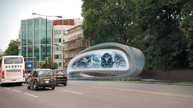
Well, here it is: the world's worst billboard. Not that billboards are ever, like, especially great. And that's why for the most part, cities don't put up new ones. Or commission one by an architect known for her tone-deaf hubris. It's like Zaha Hadid swept up some of the trash from her vagina stadium in Qatar and plopped it onto a curb in London.
This butt-ugly heap of twisting sheet metal is thanks to JC Decaux, the same company which you can thank for pretty much all the advertising currently cluttering our city streets. The digital screen (which is kind of awkwardly and distractingly close to drivers, right?) will blast messages at oncoming traffic while performing no other purpose on the streetscape. No bus stop, no bench. Just a blobular reminder of OMEGA WATCHES, for all.
What could possibly make this whole thing worse? The statement from the architects:
The contrast between the organic structure and its surroundings enhances the character of the area, which adjoins one of the busiest trafficked routes into London.
Wait, what?
(end clip, there's more)

Hmm, I like it in the alternate views provided in the article, at least at first glance, though not especially this first view. What do you think?
My opinions on billboards, large or small, wretchedly untaken care of or stylish in some way, usually has to do with their location and then with their size. I used to have little fits as I drove along the bayside highway between Arcata, CA and Eureka, CA: ugly mess up of the view of the bay, which was in itself gorgeous; in my opinion, shouldn't have been permitted there. I'll post a photo if I find one that shows some of that.
If I remember, Sao Paulo is a city that won't allow billboards. Wonder if that is still true.
Meantime, opinions and photos if you want to add some..
Gizmodo link via ArchNewsNow website. Images in article from Zaha Hadid Architects via Dezeen.