21
   

Logo change - what a mistake


chai2
 
Reply Thu 20 May, 2010 05:49 pm
Seattle's Best Coffee

Current logos...
http://chicagofree.info/wp-content/uploads/2009/05/seattles-best-coffee.jpg
http://www.coffeeicon.com/core_images/store_images/6360.jpg


New logo...
http://rds.yahoo.com/_ylt=A9G_bDlxxfVL4CEAokSjzbkF/SIG=12kscsajn/EXP=1274484465/**http%3a//seattletimes.nwsource.com/ABPub/2010/05/11/2011839225.jpg


Seriously, WTF?

I'll be honest, I've never had a Seattle's Best, but I'm familiar with the logo. I sure won't get one with this new crapola image.

When I first saw this, along with a news story, I first just logically tried to see what it was they were portraying.
I said, "that's a smiling mouth with drop of coffee in it"
Might be right, might be wrong, that's what I immediately saw.

Then reading a few lines of the article, and how people felt, I looked again to see what I was feeling.

In no particular order, here are some of the ideas that flittered through my mind in a few seconds.

It looks like a generic rest room sign at an airport
ditto at a gas station.
I feel like I'm standing in the customer service line at Target
This coffee will be burnt because it's been sitting on the burner at that corner convenience store for 4 or 5 hours.
Wow this looks cheap
I don't want the coffee in that cup.


From the little I read, SBC was actually going for this "generic look"

Well, I'm not a generic person, neither are you. I don't want your generic cup with generic coffee.

How can you mix the idea of Seattles "BEST" with, "we wanted to look generic"???

I don't drink a lot of coffee, but when I do, I want it fresh, flavorful, strong and hot.

This logo says, old, watery or burned, tepid.

I'd like to know what idiot came up with this idea.


  • Topic Stats
  • Top Replies
  • Link to this Topic
Type: Discussion • Score: 21 • Views: 12,414 • Replies: 52
No top replies

 
Cycloptichorn
 
  2  
Reply Thu 20 May, 2010 05:50 pm
I instantly thought of the oil gusher in the gulf, dunno why

Middle-management in Marketing has to justify their existence somehow...

Cycloptichorn
chai2
 
  2  
Reply Thu 20 May, 2010 05:55 pm
@Cycloptichorn,
hmmm...maybe that drop reminded you of oil?

does this cup entice you to partake of some java?
tsarstepan
 
  1  
Reply Thu 20 May, 2010 06:31 pm
@chai2,
I strongly disagree with you. I actually really like its near minimalist modern design.
tsarstepan
 
  1  
Reply Thu 20 May, 2010 06:33 pm
@tsarstepan,
I even like the new shade of red better then the old red and brown cup.
0 Replies
 
ossobuco
 
  1  
Reply Thu 20 May, 2010 06:36 pm
@chai2,
Ok, ok, finally I agree with you entirely.
chai2
 
  1  
Reply Thu 20 May, 2010 07:09 pm
@tsarstepan,
tsarstepan wrote:

I strongly disagree with you. I actually really like its near minimalist modern design.


coffee is supposed to be a comfort.

This cup makes me confused and frightened.


ok here's another example.
I had seen this brand of orange juice at the market, and without reading the brand name, just going by the picture, I thought "that's the cheap, lower quality store brand"

BTW, I'm not big on orange juice, so it wasn't like I was looking for "my" brand.

What I was seeing was Tropicana's new packaging.

http://rds.yahoo.com/_ylt=A9G_bDqe2PVL4w4A3DCjzbkF/SIG=13g14ldcr/EXP=1274489374/**http%3a//blog.brandcrystal.com/__oneclick_uploads/2009/04/tropicana-orange-juice-packaging.jpg

The picture on the right just says bleech.

Back to coffee for a moment.
I'm kinda weird about how I drink my coffee. I absolutely don't like to drink coffee out of ceramic mug. Tea is a mug is fine, as are cold beverages in a glass.
There's just something not right feeling about my lips on a ceramic mug that's got coffee in it.

That said, a long time ago I found and purchased online a case of these cups...

http://www.deadprogrammer.com/photos/greek-cups-anthora.jpg

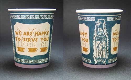
mmmm.....my morning cup never tasted so good. Don't worry, I would rinse it out and use a few times before recyling.

When I realized I was runny out, I couldn't find them immediately online. In a panic, I scoured the interweb for something, anything that wasn't ceramic.
Fortunately I found this...

http://www.rcmsales.com/ebay/ClassicT1948_4_00060001.jpg

Well, not this exactly, because I don't drink instant, and it wasn't a black & white photo. But, what is was, was Maxwell House blue paper cups, with the appropriate logo, and "good to the last drop" written on it.

I am enjoying the use of one right now, except that I've got some diet ginger ale in it.

My point being....

uh....

lessee.....


coffee tastes best in blue paper cups!

yeah, or one's that look nice, like SBC, and don't look like men's rooms signs.

Rockhead
 
  1  
Reply Thu 20 May, 2010 07:12 pm
@chai2,
that was my thought.

public restroom.

(when I was in Seattle, I drank my joe there instead of Starbutts)
chai2
 
  1  
Reply Thu 20 May, 2010 07:17 pm
@Rockhead,
You drank your coffee in a public restroom?


(oh c'mon, you saw that coming)
Rockhead
 
  1  
Reply Thu 20 May, 2010 07:20 pm
@chai2,
but I purchased it from Seattles best.

mostly I bought street coffee in the market...
0 Replies
 
jespah
 
  1  
Reply Fri 21 May, 2010 04:18 am
I wonder if they think they're appealing to the dieting crowd. Big hint: at least this dieting gal doesn't want things that look diet. I want them to look big, rich and flavorful, to give that kind of a look and feel when the taste and mouth appeal can't.
tsarstepan
 
  1  
Reply Fri 21 May, 2010 04:39 am
@jespah,
I'm not sure I understand such oddly displaced anger at a modernization of a company's logo or why you associate this new logo with dieting jespah.

I seriously think this new logo can eventually find its way into the design section of the Museum of Modern Art. It's that sleek. Cool
jespah
 
  1  
Reply Fri 21 May, 2010 04:50 am
@tsarstepan,
Not anger. It just seems overly spare. The older logo seems to me to evoke more decadence.
0 Replies
 
ehBeth
 
  1  
Reply Fri 21 May, 2010 05:08 am
@chai2,
I much prefer the new cup and logo. Crisp, clean, modern. The old was a little too Jane Parker.

The red semi-circle suggests (to me) one of those trendy coffee bowls that 'real' coffee shops use. The white drop I'm not sure about. Makes me think the cup should be holding water, not coffee.
sozobe
 
  1  
Reply Fri 21 May, 2010 05:27 am
@chai2,
Well I don't really like either of 'em so there. Smile

The first one looks dated and kinda boring. The second one I'm more inclined to like, but it makes me think of something medical, perhaps a blood donor station. (That red + drop definitely speaks "blood" to me.)

Maybe they're trying to subconsciously capitalize on the vampire trend? Wink
chai2
 
  1  
Reply Fri 21 May, 2010 05:35 am
@jespah,
jespah wrote:

I wonder if they think they're appealing to the dieting crowd. Big hint: at least this dieting gal doesn't want things that look diet. I want them to look big, rich and flavorful, to give that kind of a look and feel when the taste and mouth appeal can't.


You think this cup makes it look big, rich and flavorful? Confused

How so?

In a way I can see what you mean, but what my conception of rich and flavorful must be different.
For instance, when I'm looking in the soup or frozen aisle, those green cans and green boxes for um, Healthy Choice(?) and the like are a big turn off to me. They just "look" like they would be bland tasting, again, too generic.
Hey! I always buy Progresso soups, broth, bread crumbs, and Barilla pasta.
Blue!

tsar, knowing your proclivity toward Hagen Daz, how do you feel about their packaging?
http://yateley-pizza.co.uk/images/hagen-dazs.jpg

Would you have been as likely to start buying it if it was in a container like this? Without the words artifically flavored of course....

http://www.frugalvillage.com/wp-content/images/tub.jpg


I don't want my food to look generic and streamlined. Since I can't readily see the food in the packaging, I'd like the package to reflect how UNgeneric and UNstreamlined my experience with it will be.

Like, "Wow, that food tasted really generic. I suppose that's all right though. Its streamlined quality made it go down so much more quickly, I didn't even notice how unspecial and unsatisfying it was."

Oh, BTW, 68% of the people polled said they didn't like SBC's new logo.
chai2
 
  1  
Reply Fri 21 May, 2010 05:43 am
@ehBeth,
ehBeth wrote:

The old was a little too Jane Parker.


Ok, I can go with that. Jane Parker reminds me of the Dick and Jane books. (soz, also acknowledging you in this)
Maybe going more in the direction of rich and robust, which is what coffee is all about?
The new logo just doesn't say "Man, you're gonna love what's inside."

Jane Parker brand....

http://graphic-design.tjs-labs.com/pictures/cake-day-12-01-1939-999.jpg
0 Replies
 
djjd62
 
  1  
Reply Fri 21 May, 2010 05:48 am
i'm a big fan of minimalist art myself, in my mind the cup design reminds me a bit of london subway logos, and makes me think of coffee an the go

http://rds.yahoo.com/_ylt=A9G_bDlxxfVL4CEAokSjzbkF/SIG=12kscsajn/EXP=1274484465/**http%3a//seattletimes.nwsource.com/ABPub/2010/05/11/2011839225.jpg

http://www.accommodationlondonuk.com/screensaver/london-underground.jpg

which is odd because i'm not british and i've never been to london england
0 Replies
 
Joe Nation
 
  1  
Reply Fri 21 May, 2010 06:38 am
It's not just food.

For years Bluette gloves came in a box. http://img01.static-nextag.com/image/SPONTEX-BLUETTES-MEDIUM-SIZE-GLOVES-1-PAIR/1/000/005/544/961/554496169.jpg

One day our order arrived and they were packaged thusly:
http://image.become.com/imageserver/s0/338175755-150-150-5-0/mapa-bluettes-latex-gloves.jpg

People hated it. Didn't think they were "real" Bluettes. Didn't want to listen to any explanations about saving trees or that sort of thing.
We couldn't give them away for the first three months or so. People bought Rubbermaid even though Rubbermaid was in a stapled display hanger like the new Bluettes one. Huh?

That wasn't the first mis-step that Bluettes had made. Back about twenty years ago, after having a box that was completely BLUE with just a minimum of lettering, they changed the box to have ---are you frigging kidding me? -- a BROWN stripe running diagonally across the front of the box.
Sales dropped off sixty per cent.

I always said that it must have been some vice-president's kid who graduated from design and marketing school who came up with that.
Joe(you can't imagine the looks of suspicion that cross the face of the American consumer.)Nation
chai2
 
  1  
Reply Fri 21 May, 2010 06:47 am
@Joe Nation,
Joe Nation wrote:

I always said that it must have been some vice-president's kid who graduated from design and marketing school who came up with that.


That's right Joe.

Problem is, once the word of approval comes from on high like that, no amount of people from within the company saying "You're kidding, right?", will change the tide.

I'd bet my next paycheck that the people working in inventory, packaging, in the lunch room at the plant, all knew it was a bad idea, re the gloves.
0 Replies


Related Topics

 
  1. Forums
  2. » Logo change - what a mistake
Copyright © 2024 MadLab, LLC :: Terms of Service :: Privacy Policy :: Page generated in 0.03 seconds on 04/18/2024 at 03:45:00